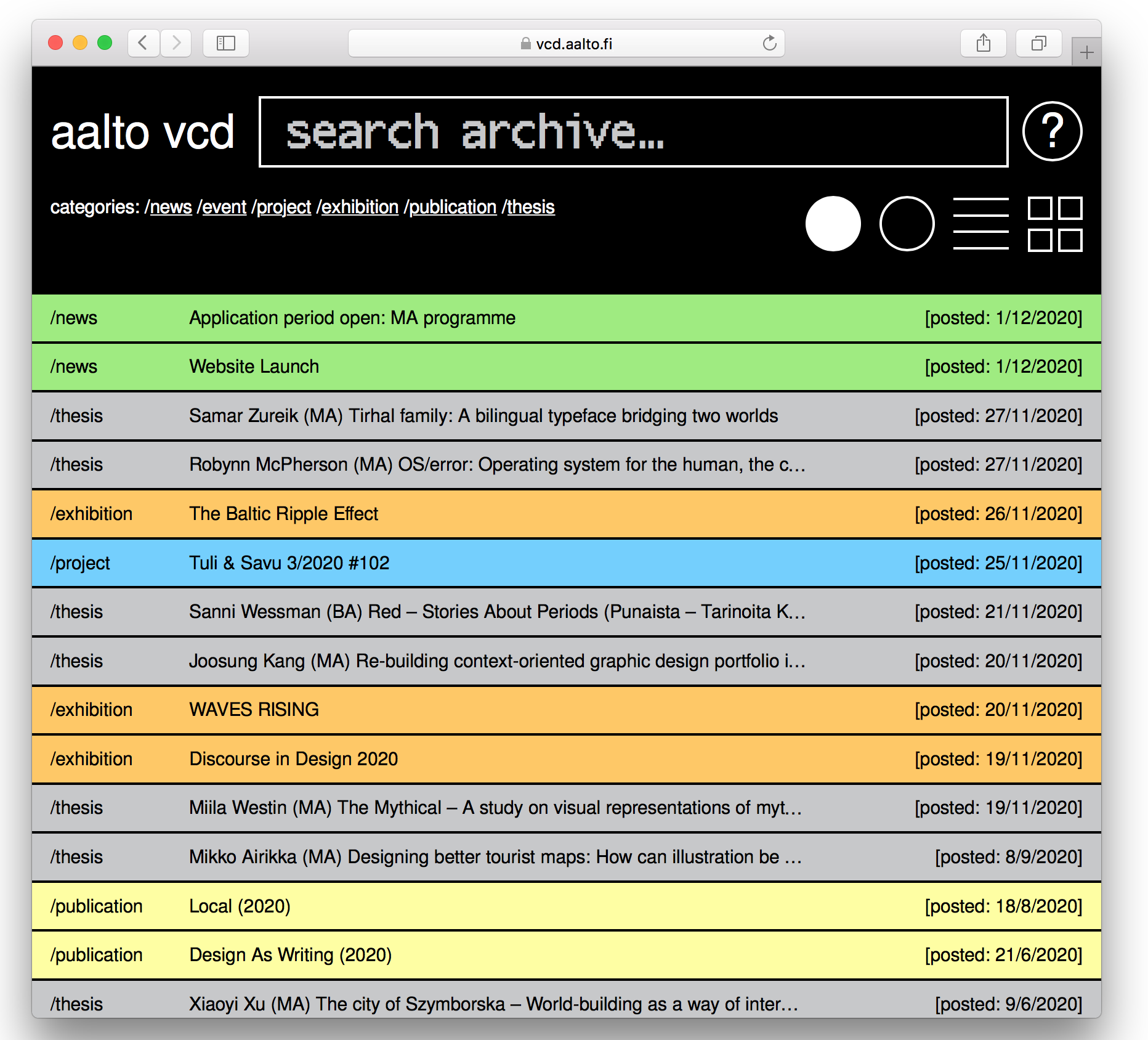
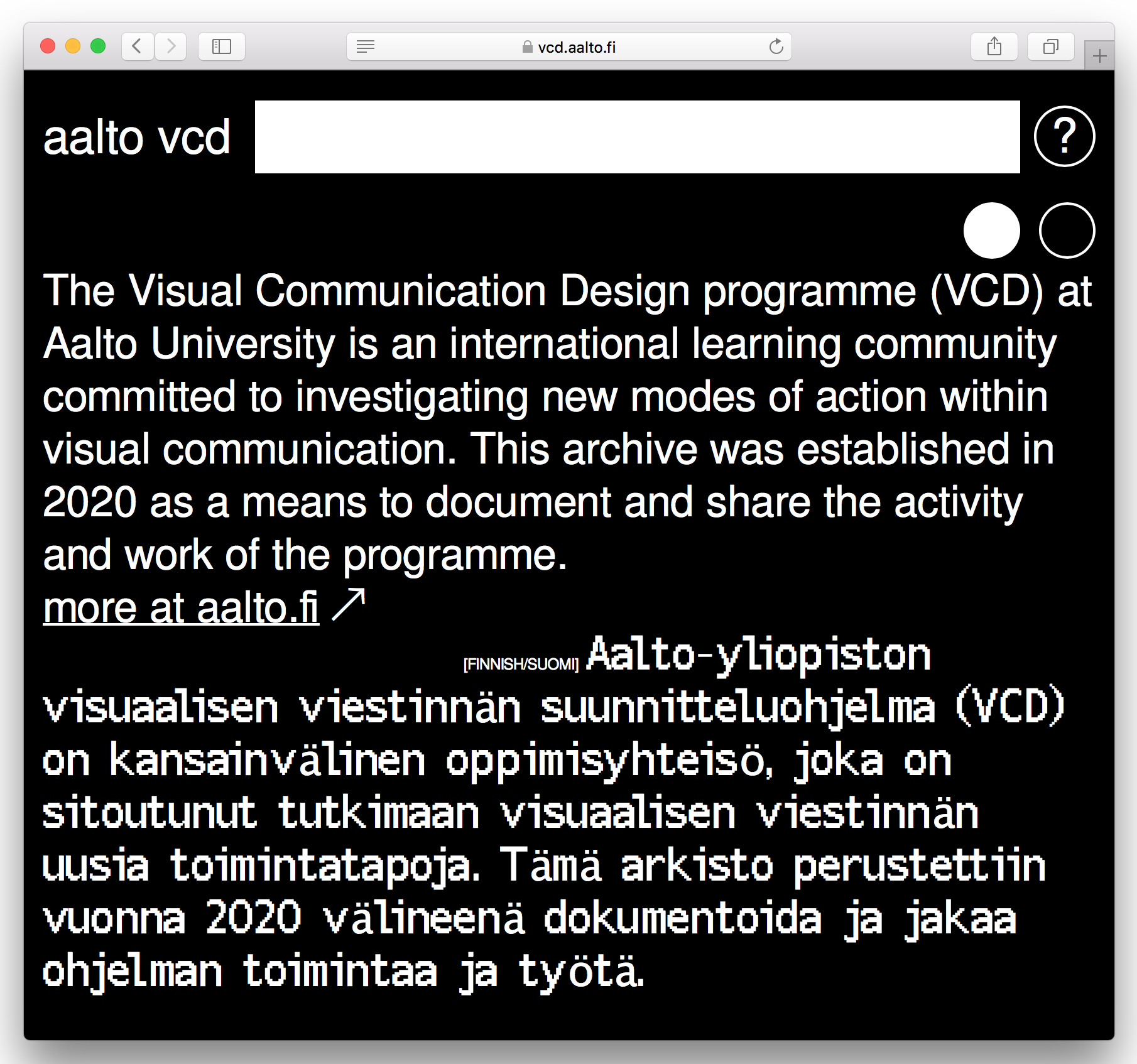
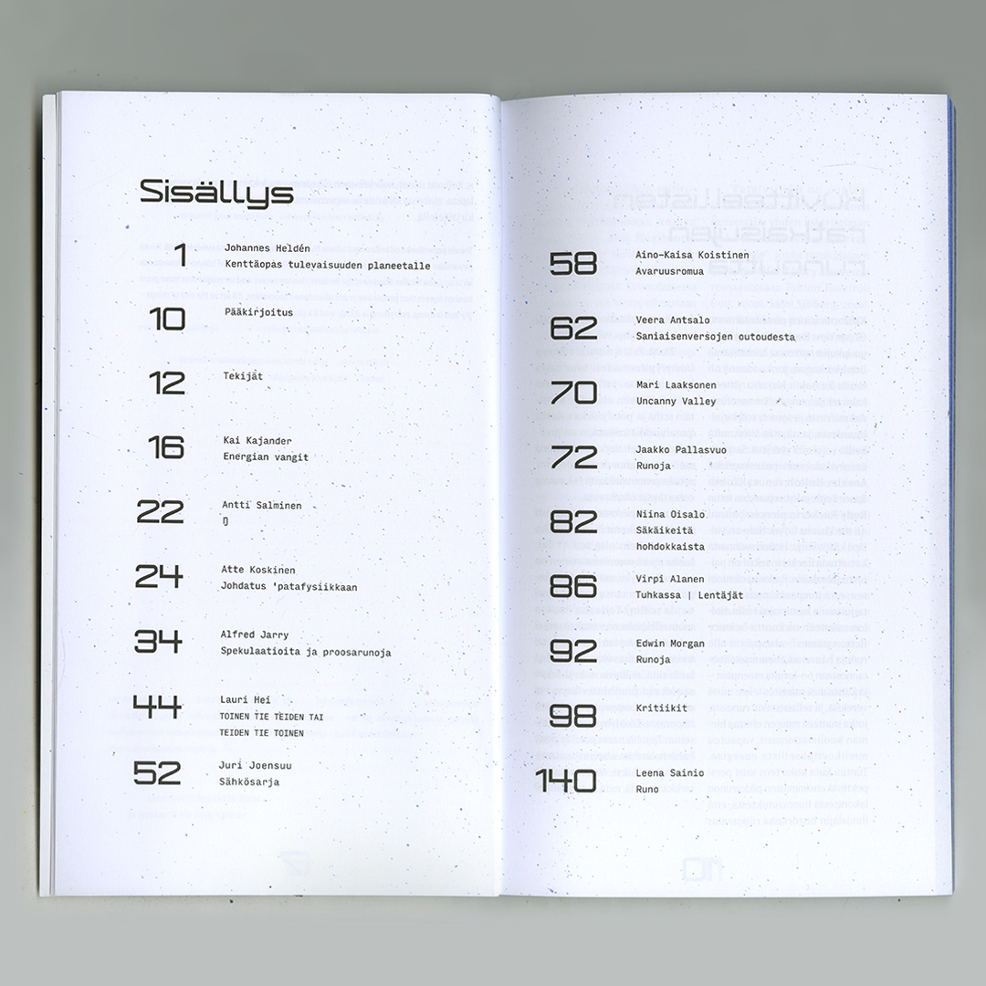
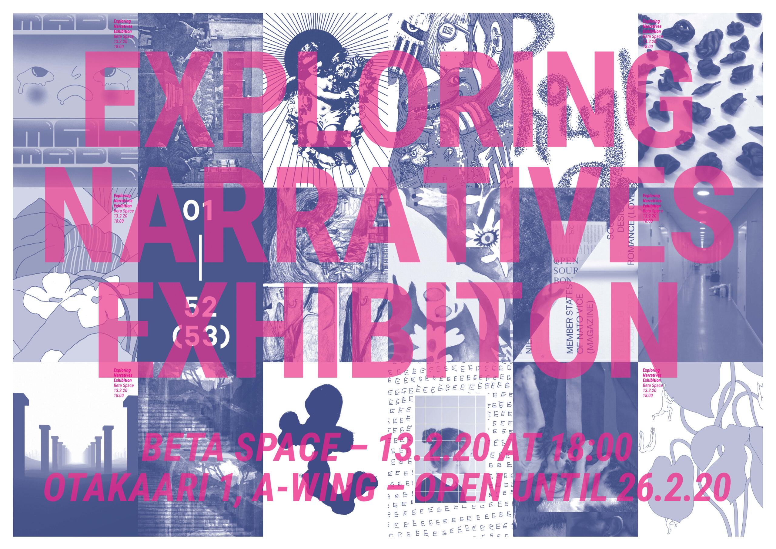
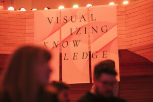
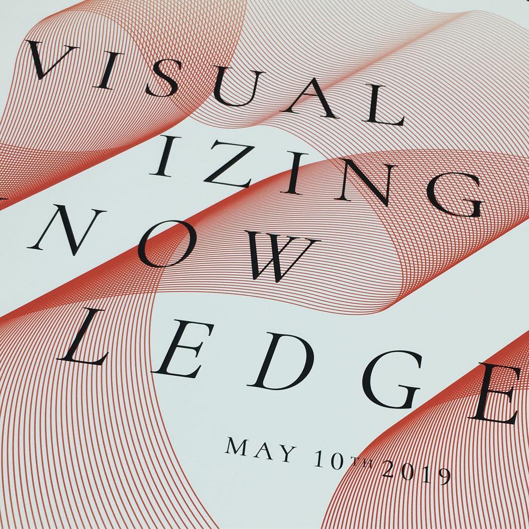
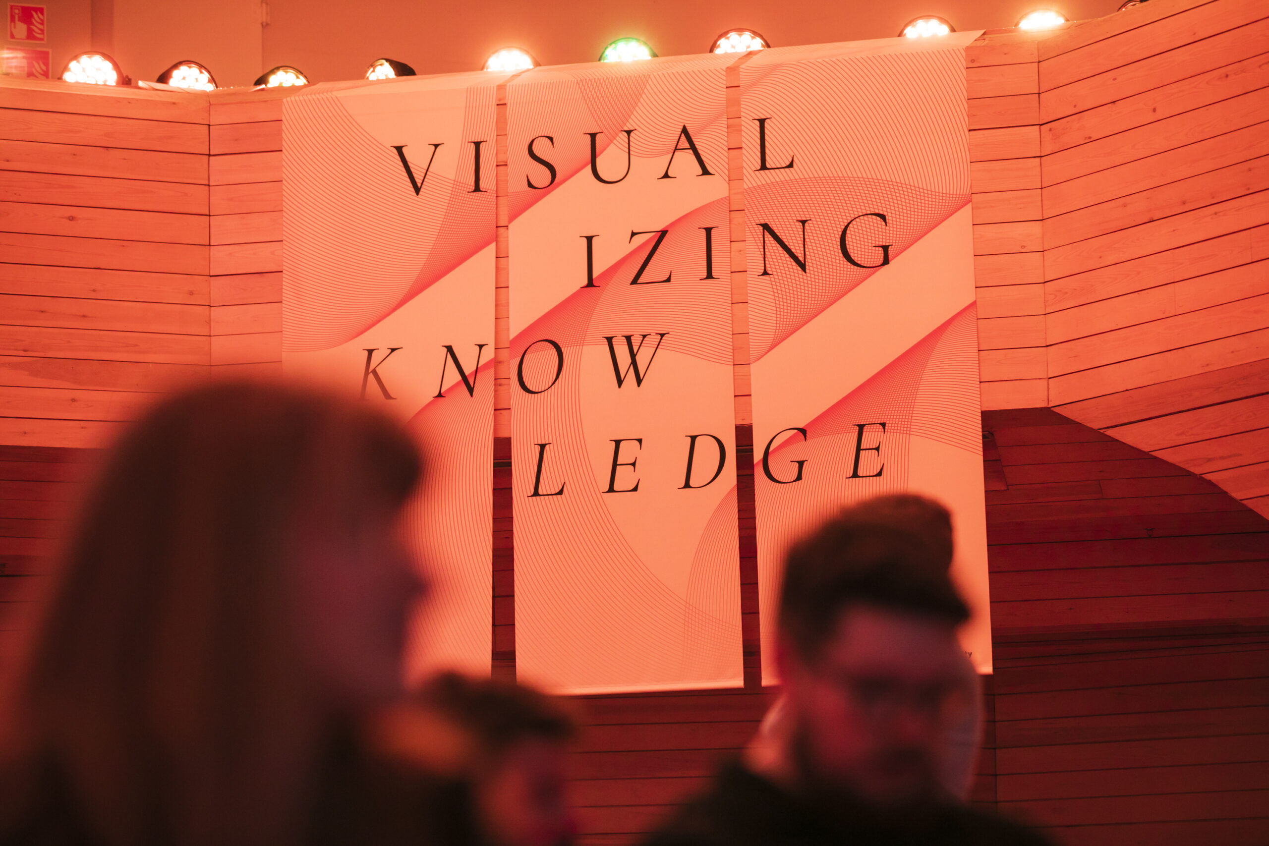
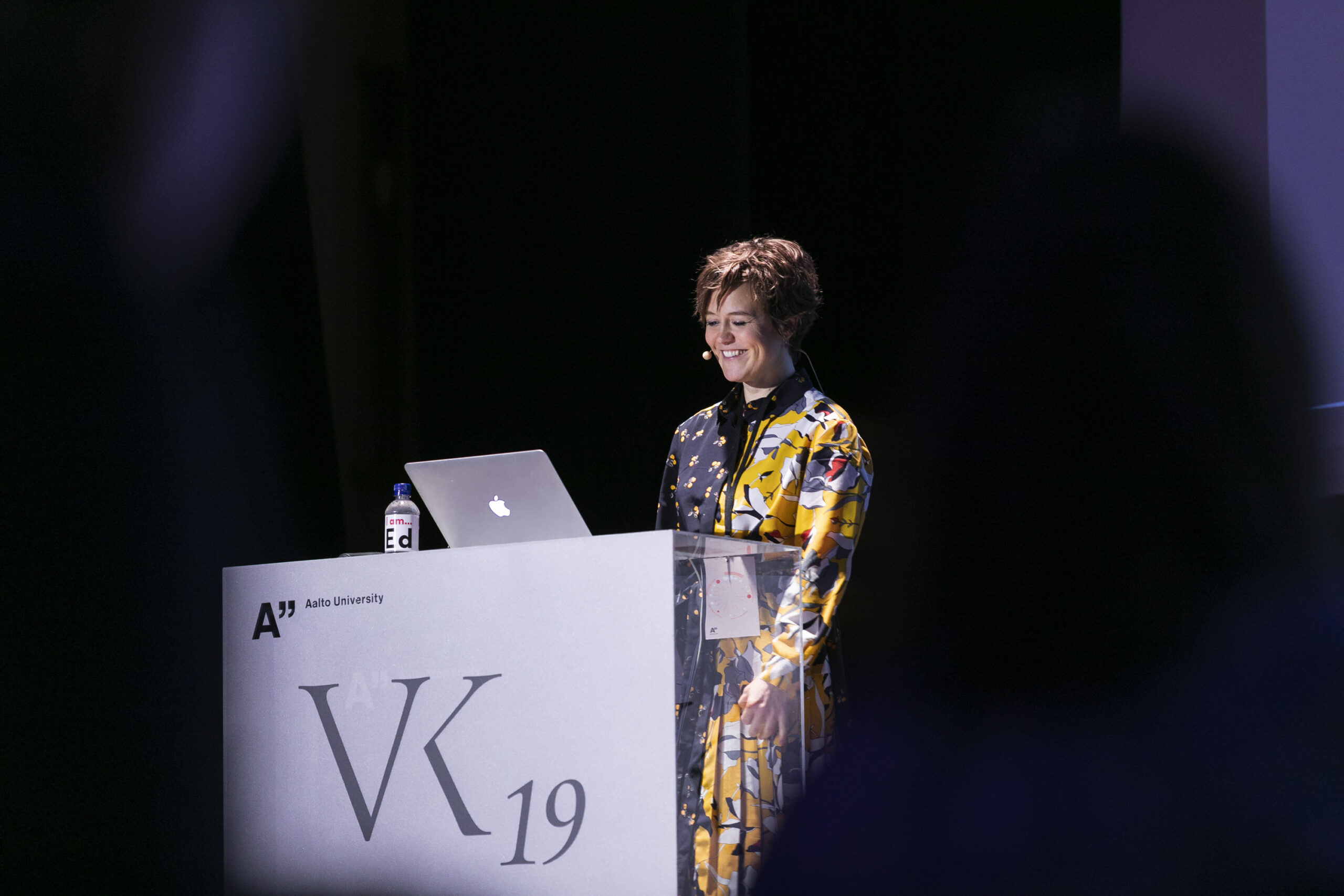
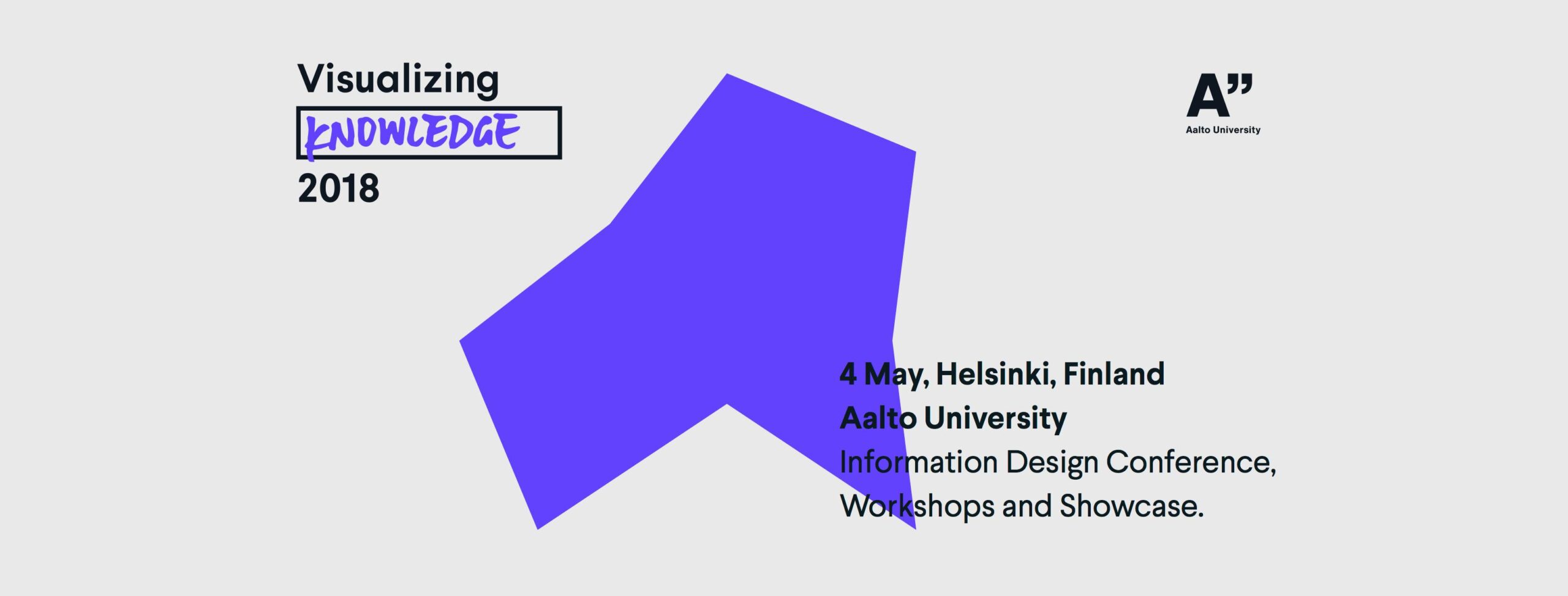
Visualizing Knowledge Conference 2019: Data Sensations
Conference: 10.5.2019
Workshops: 8-9.5.2019
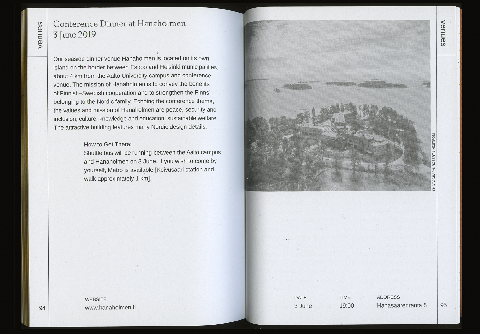
Dipoli, Aalto University
Otakaari 24, 02150, Espoo, Finland
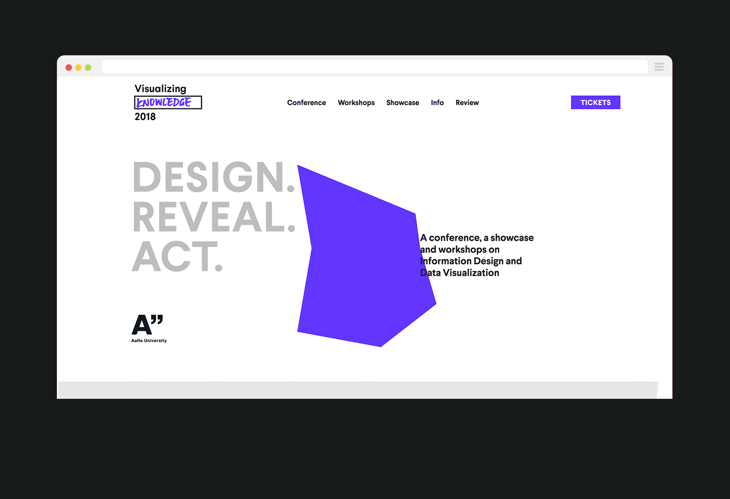
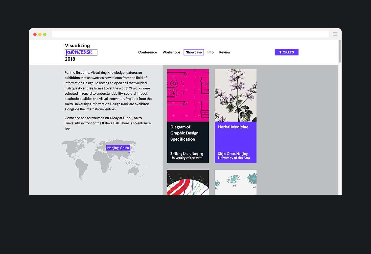
VK19 – Data Sensations
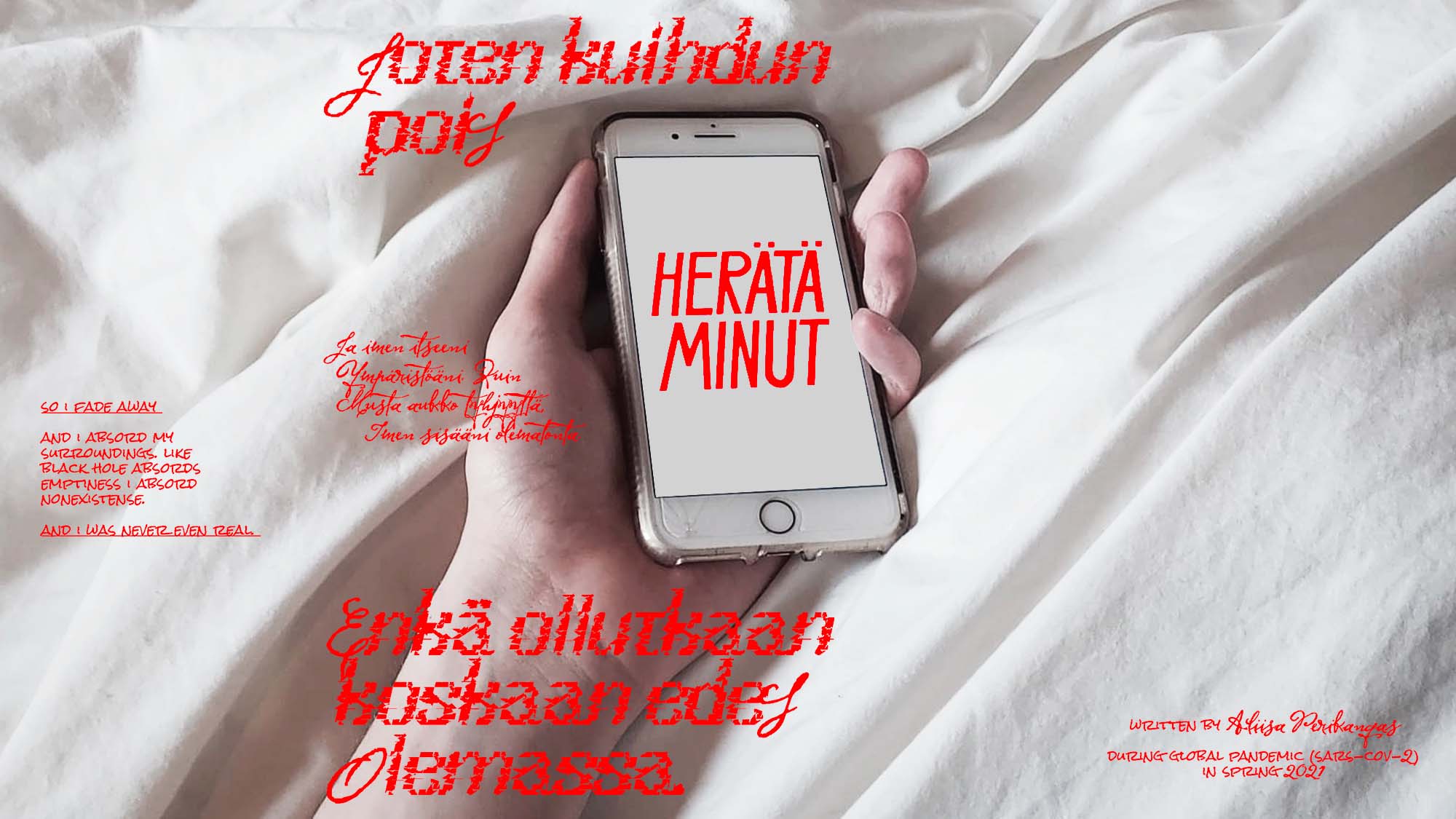
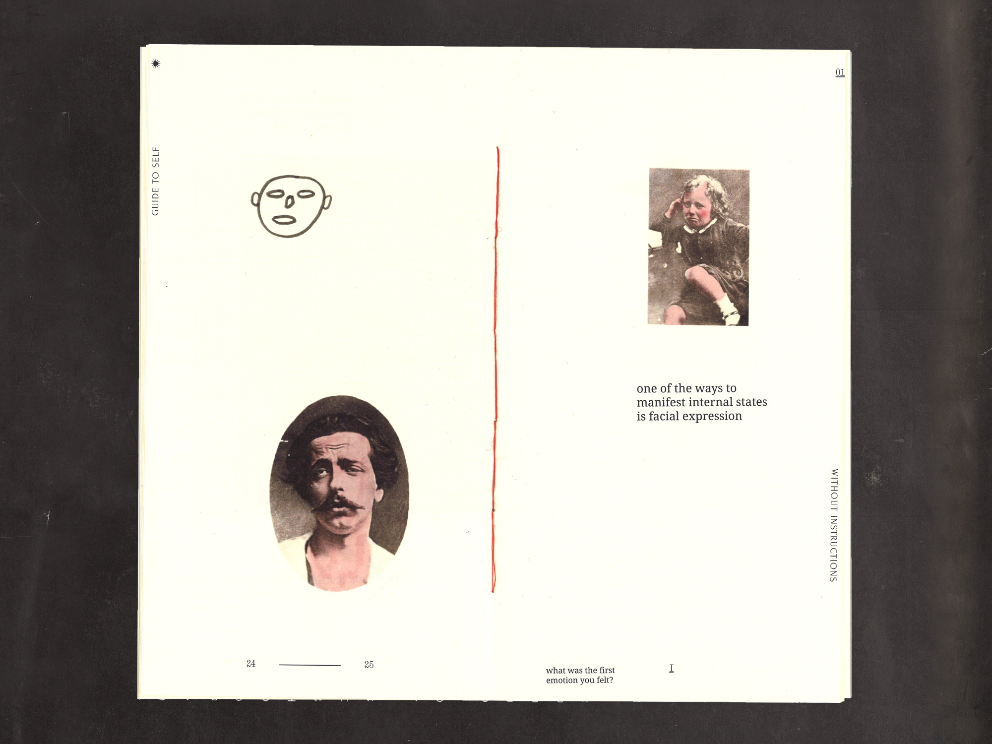
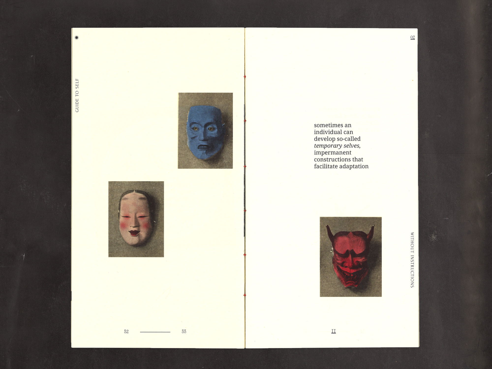
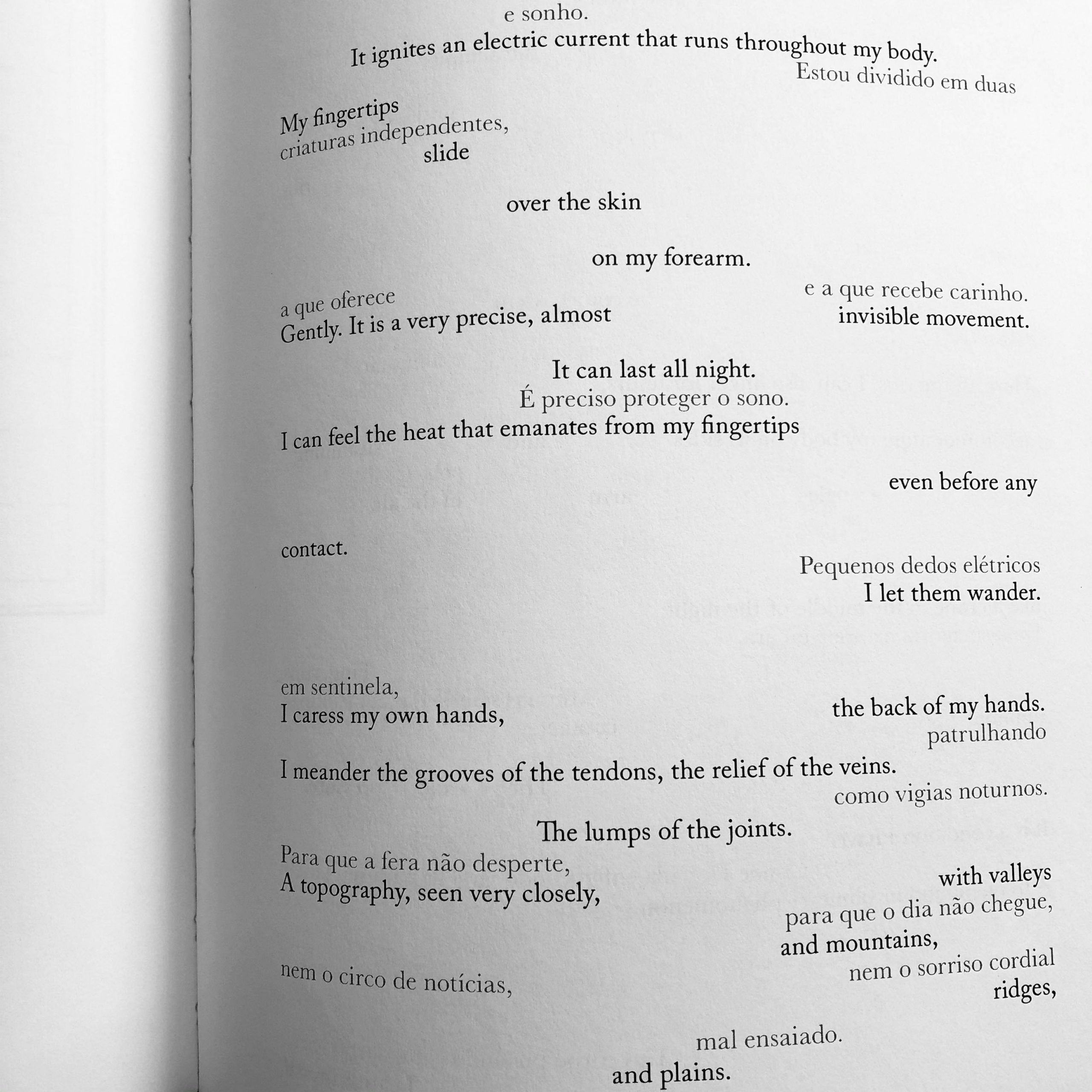
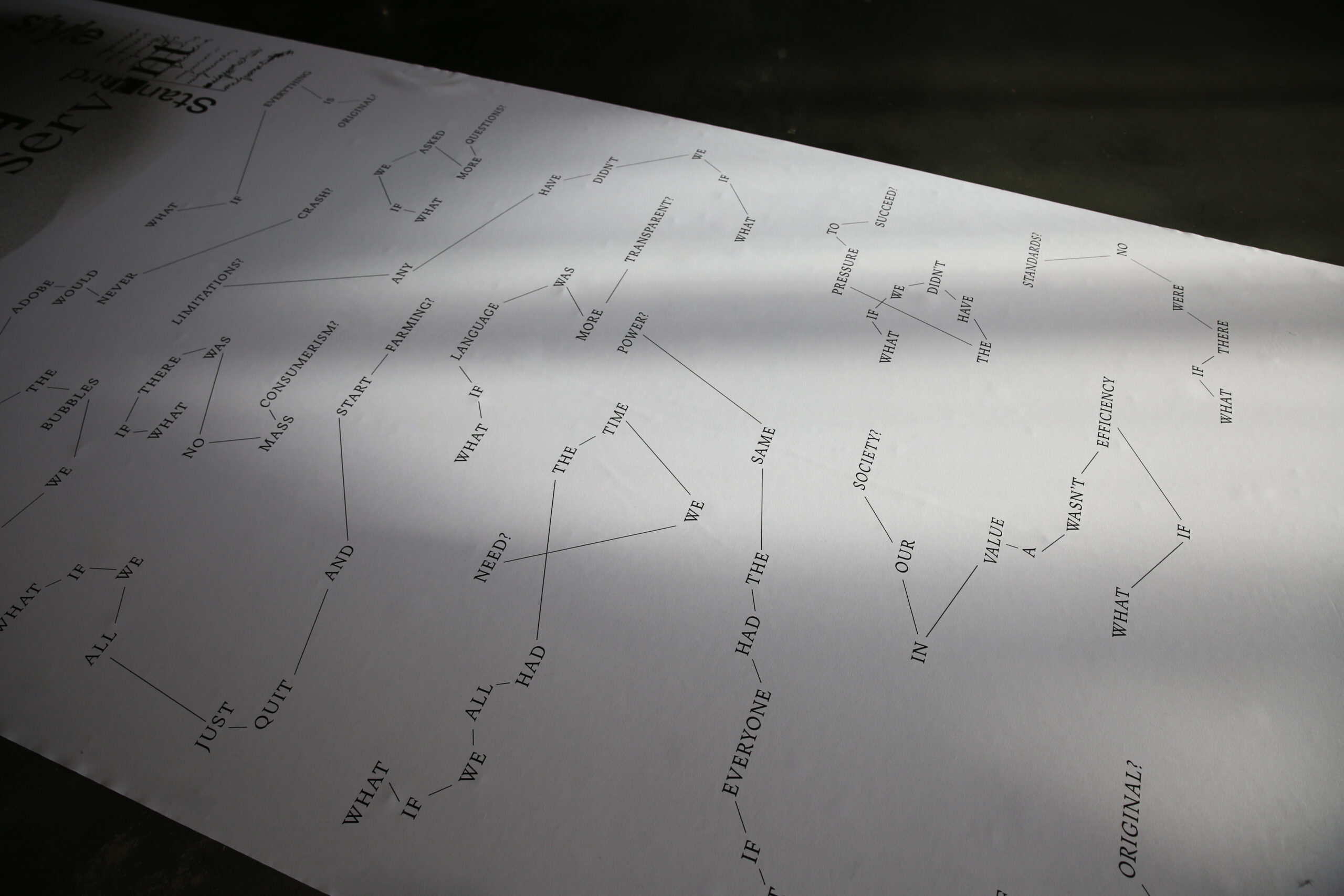
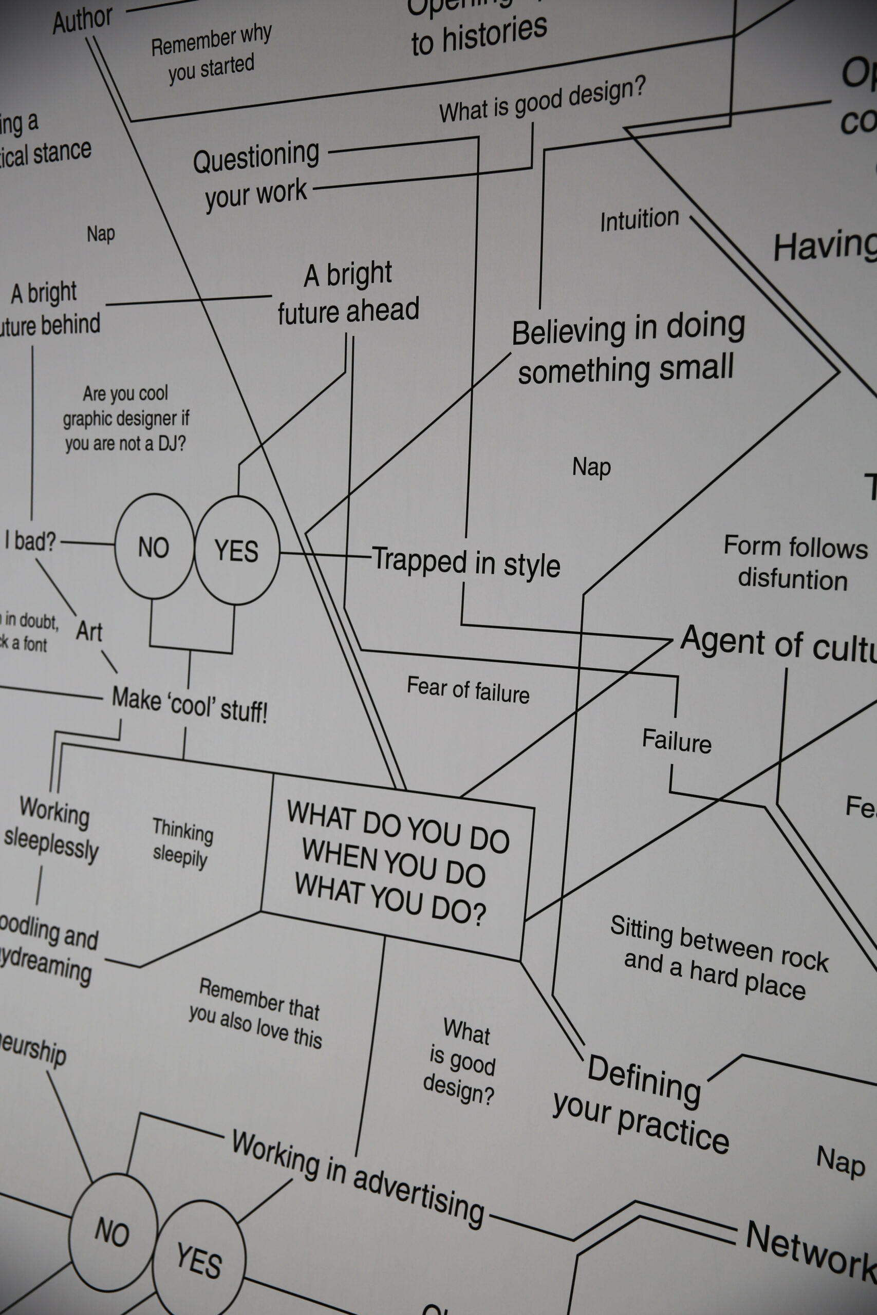
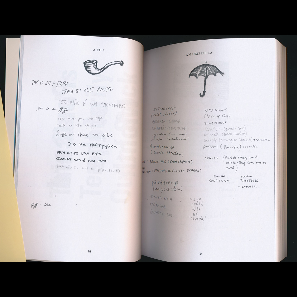
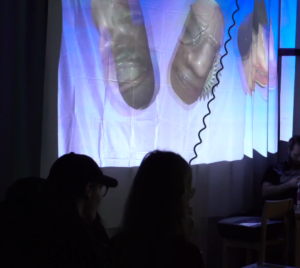
We rely on our senses to evaluate the kaleidoscopic theatre of phenomena around us. Essential to the understanding of our environment is a translation of the external world to our internal experience, performed in concert by our senses. These senses extend beyond only visual perception—we shape textures with our skin, encounter memories with our nose, and appraise music with our ears.
Today, we extend these senses through a myriad of machines and sensors, which simultaneously collect and contribute to the surplus of data that comprises our world. Much of this information remains under-utilized or in its raw form. Only when guided by a certain inquiry can we establish understanding and return patterns in familiar forms.
Further still, one of the most important considerations in information design is the user experience. Which senses are, or could be, involved? How do our senses influence the information itself? Meaningful design should resonate in the senses as much as any other experience.
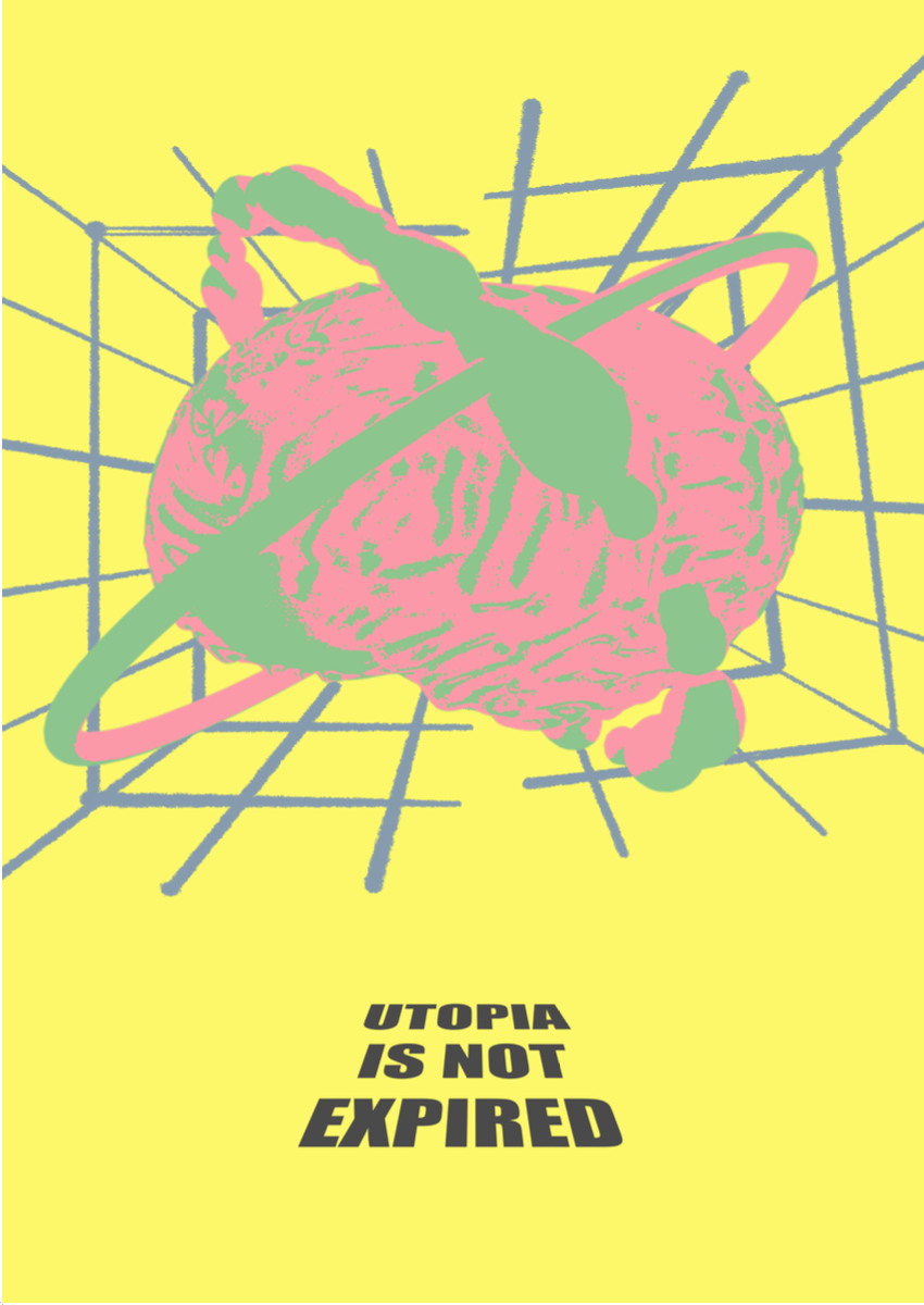
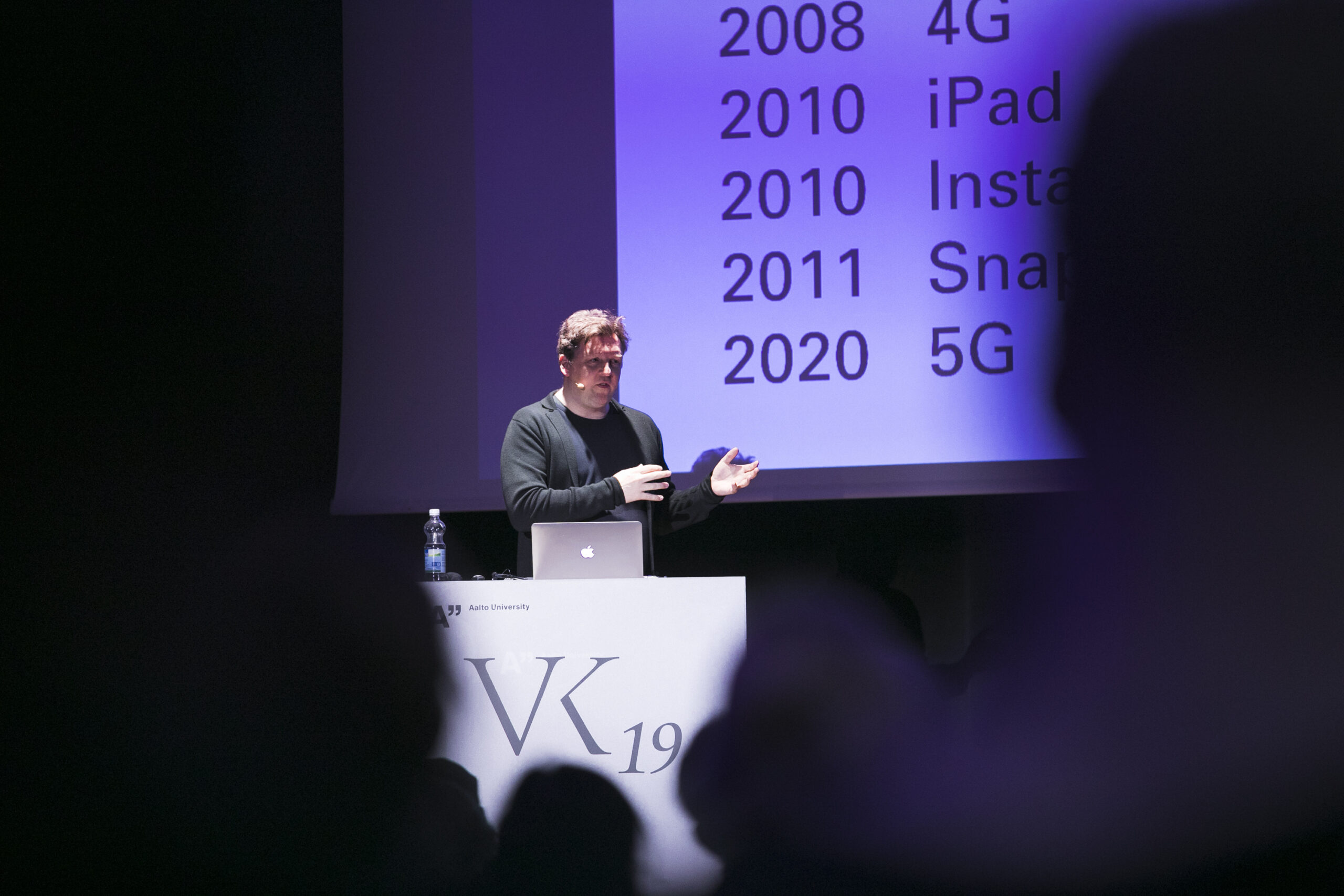
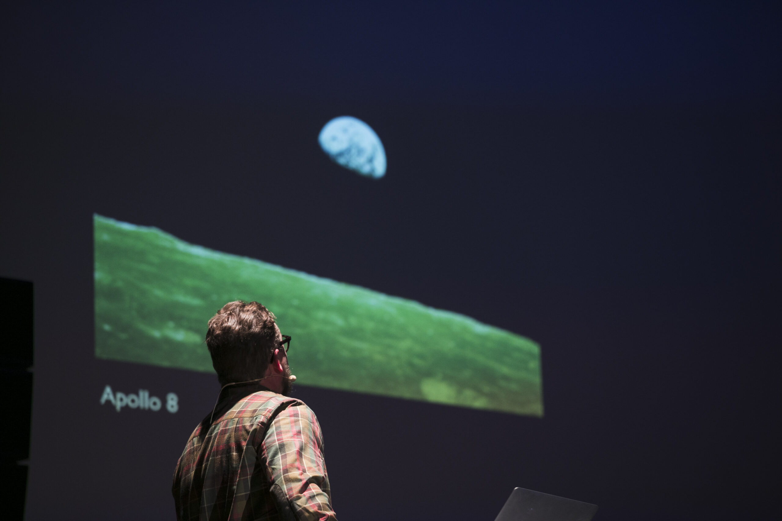
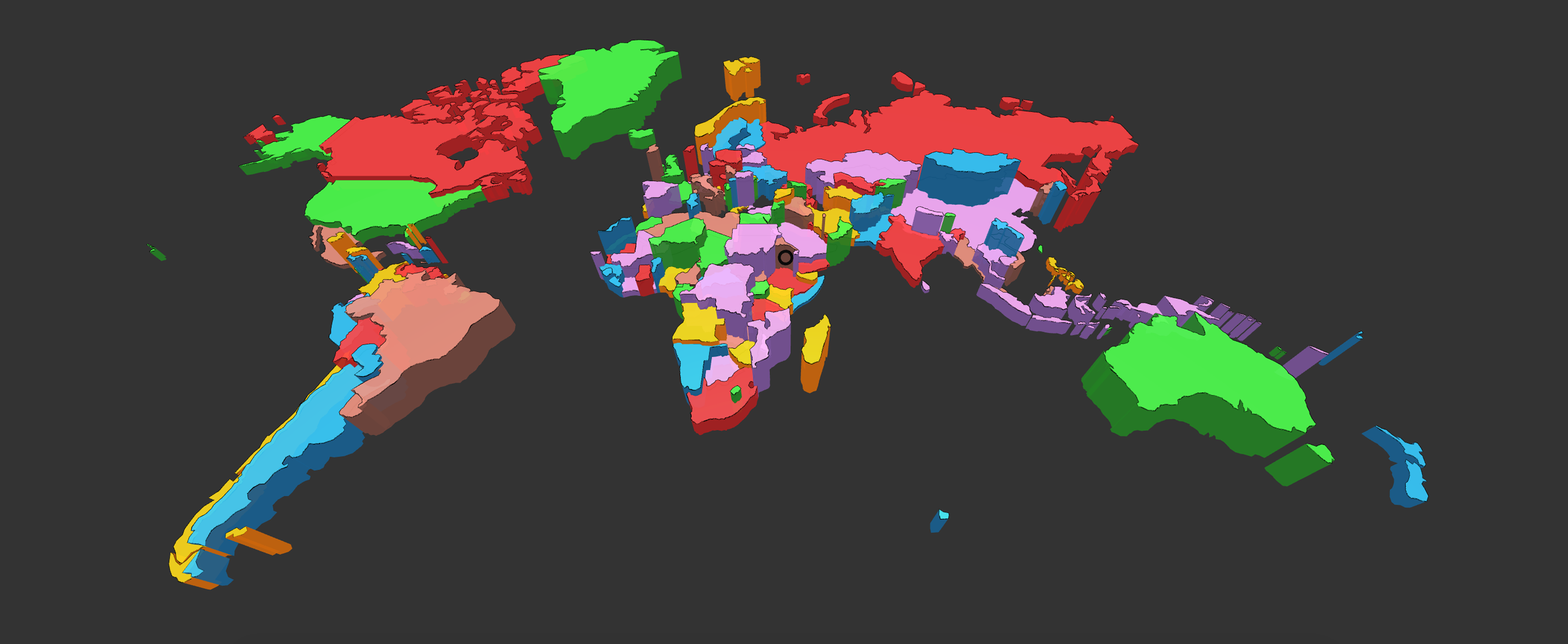
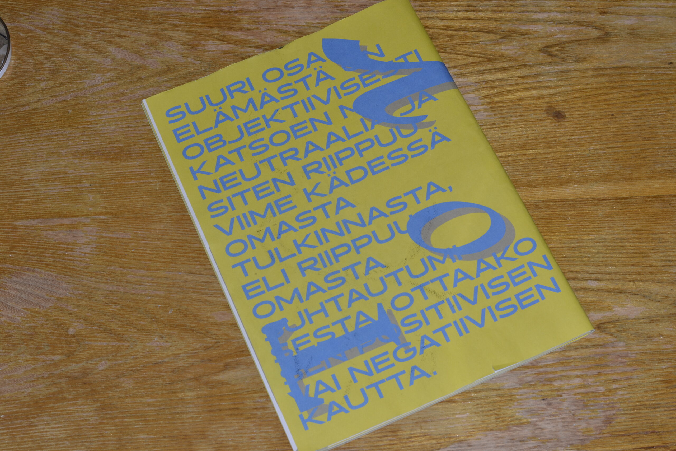
The subject of this year’s conference is the human senses and their role in information design. Topics under consideration include current and future methods in the use of sensory data, data collection and representation, media considerations, and production techniques.
Website: https://vizknowledge.aalto.fi/archive/2019/
[Aalto University Staff & Faculty]
Prof. Rupesh Vyas – Project Lead
Minna Ainoa – Producer, Department of Media
Moona Tikka – Event Coordinator
Research Engineer Veli-Matti Saarinen – Thermal Photobooth, Department of Neuroscience and Biomedical Engineering
[Student Team]
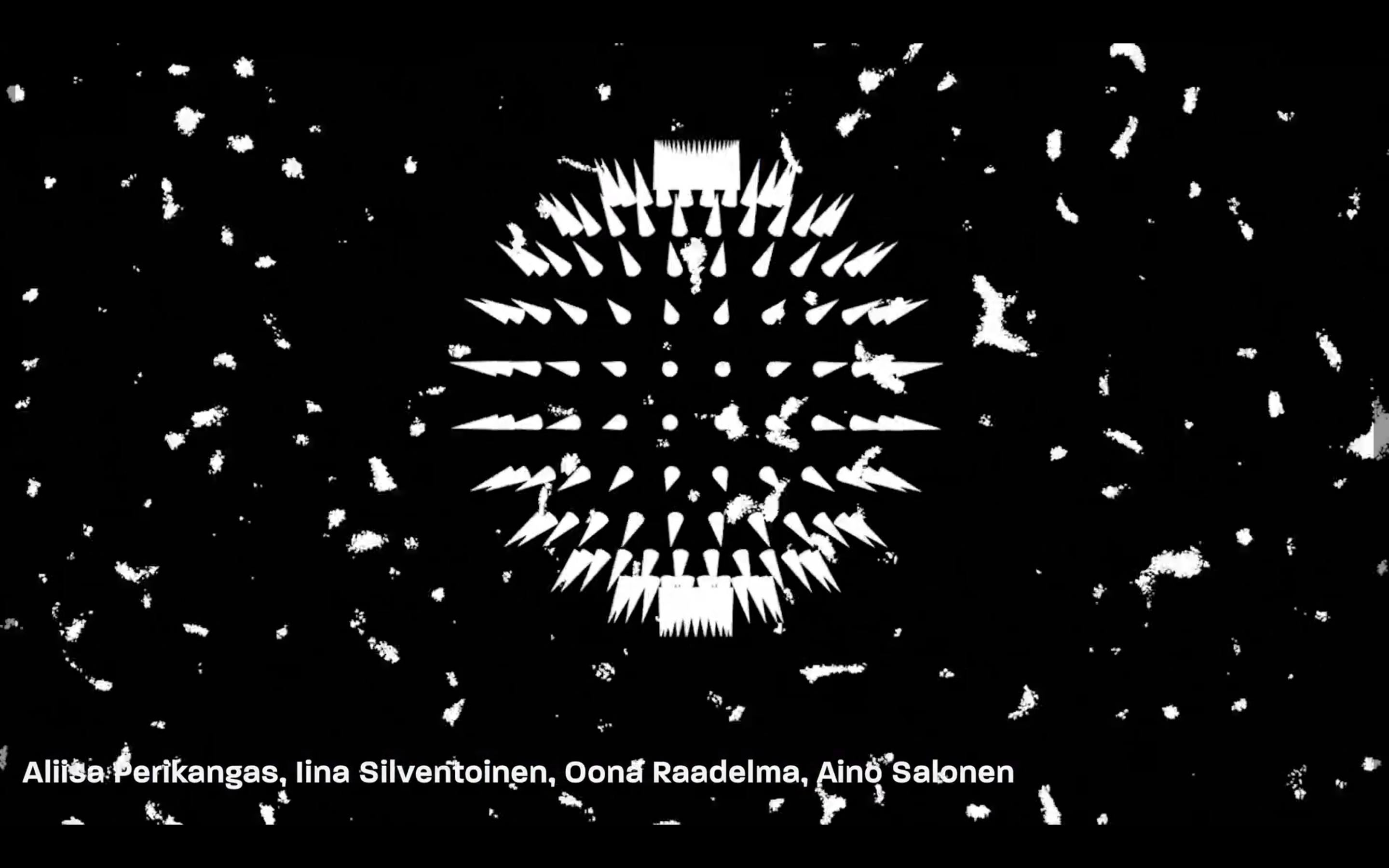
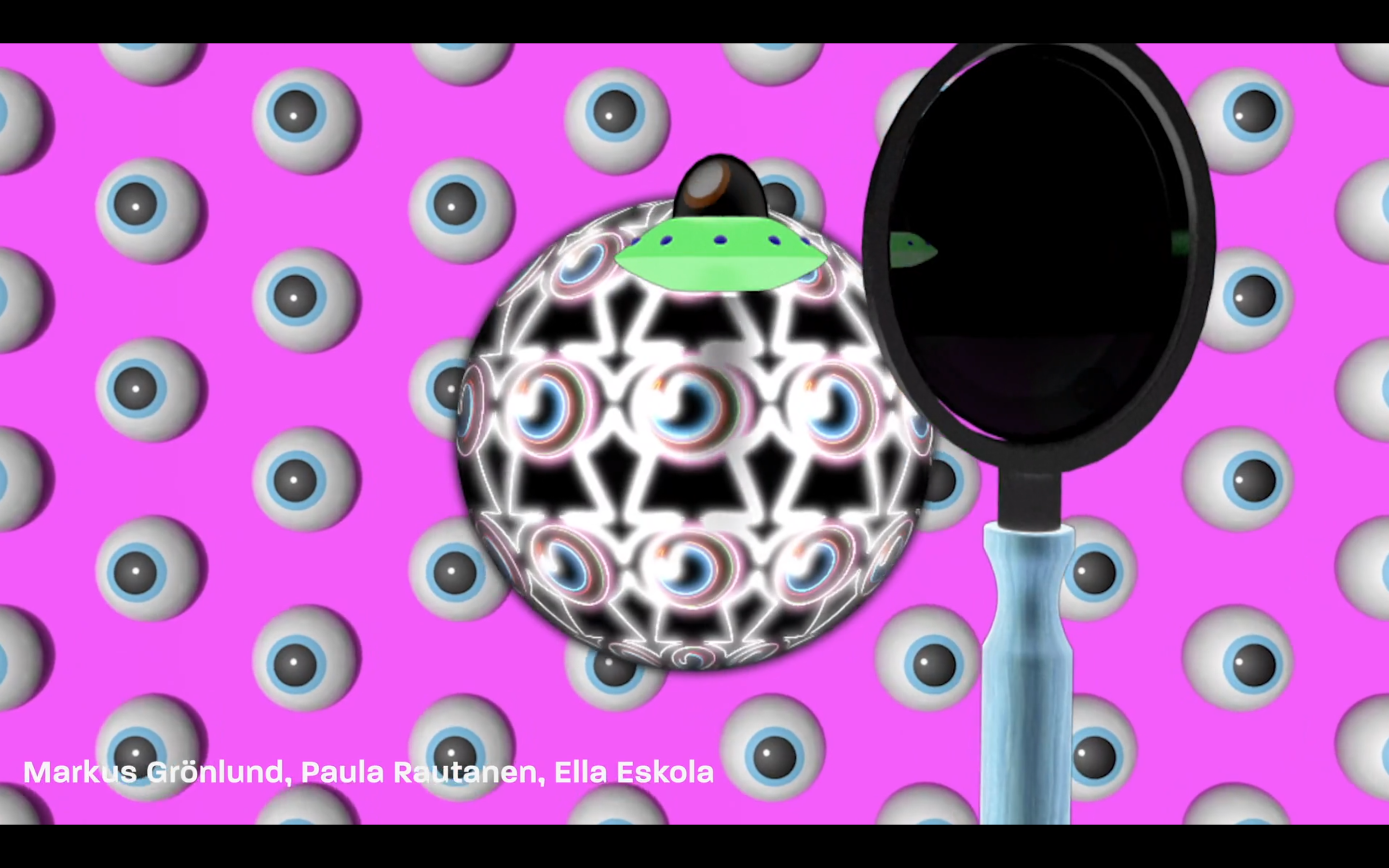
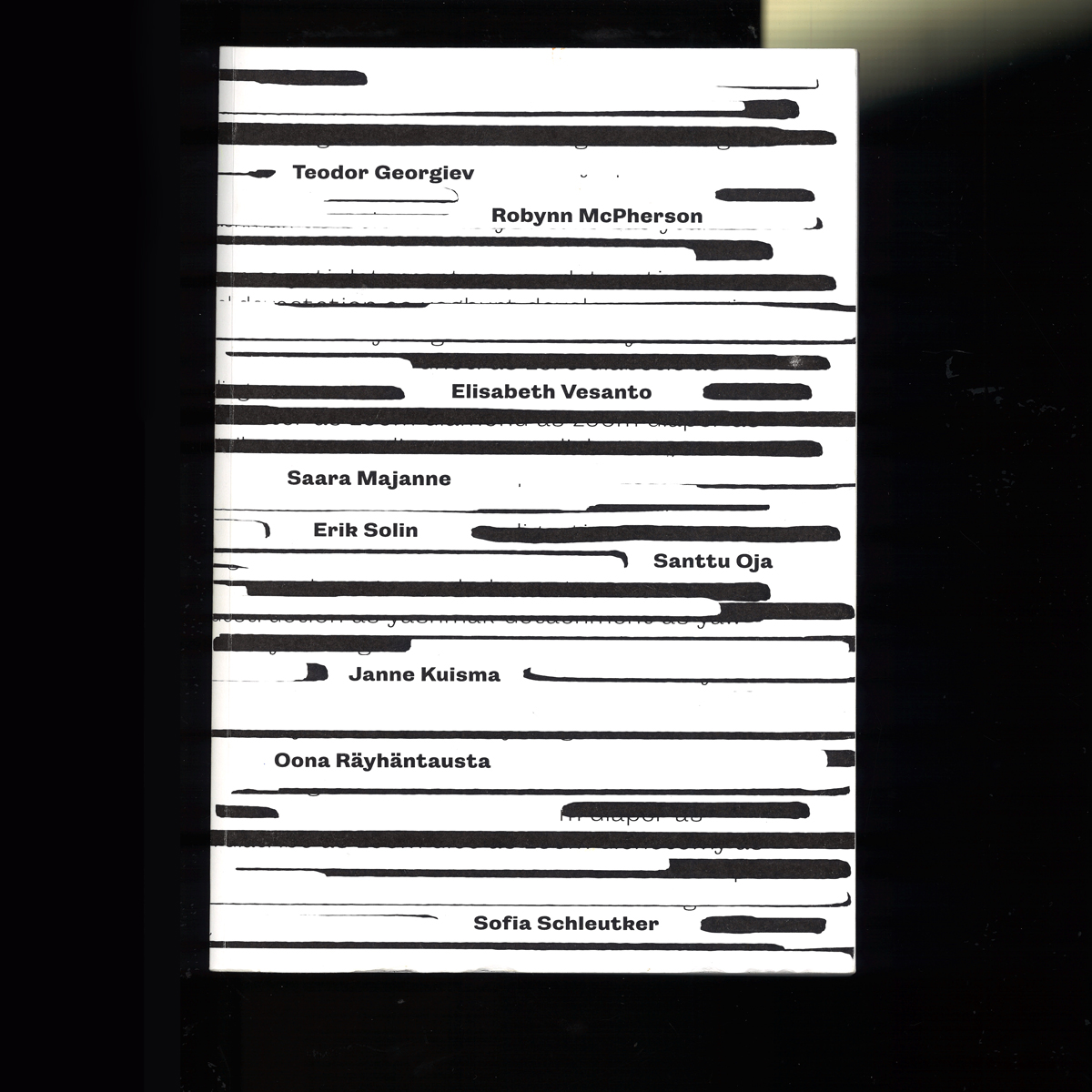
Sofia Schleutker – Team Lead & PR
Saara Majanne – Visual Design
Utkarsh Raut – Animation & Production
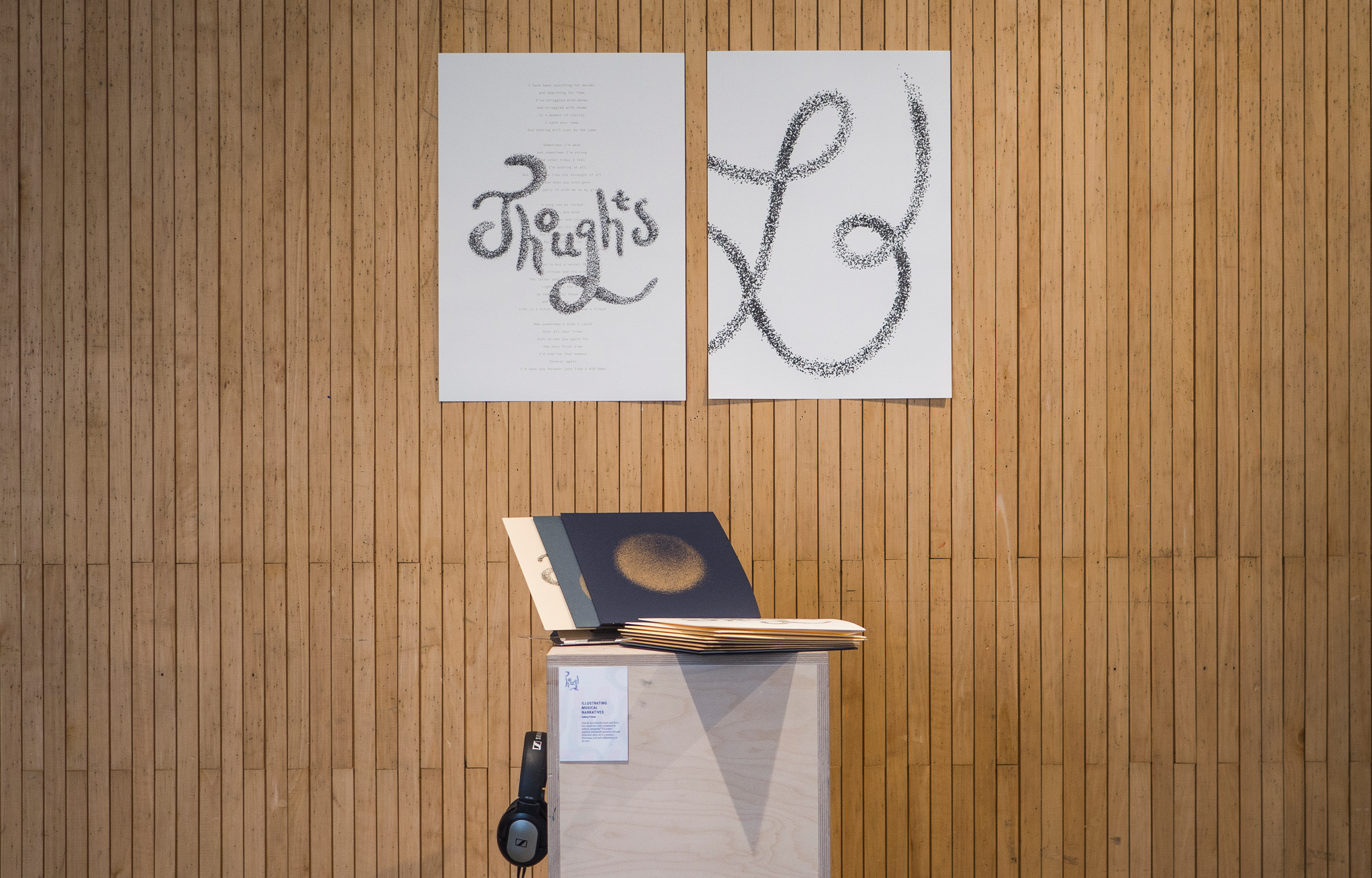
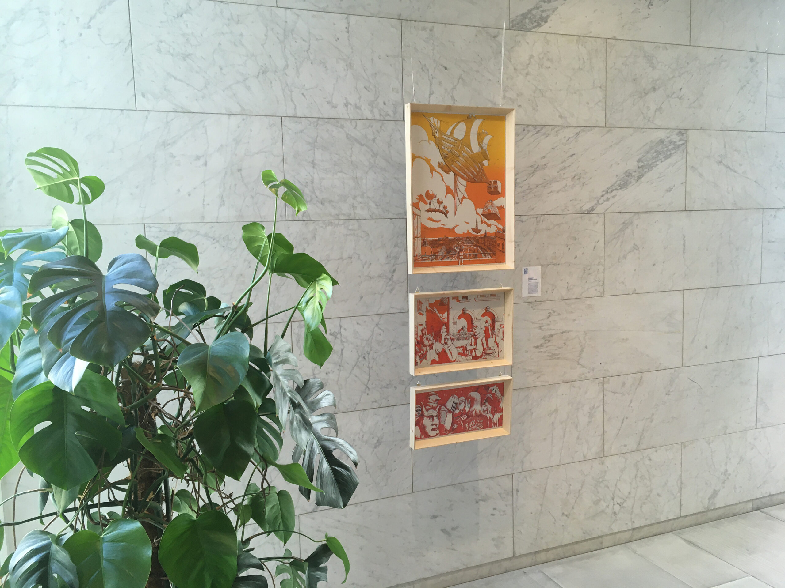
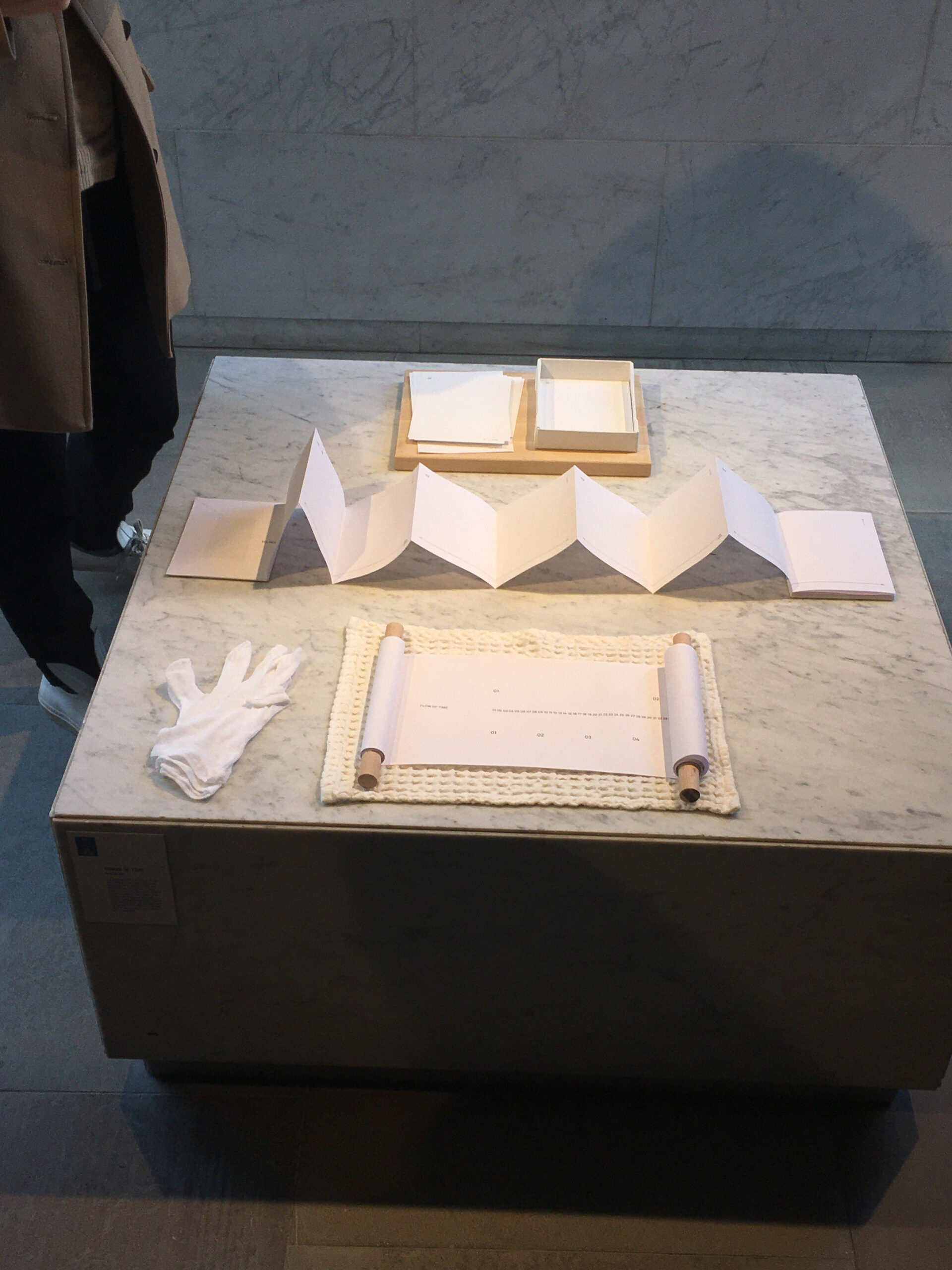
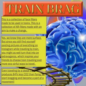
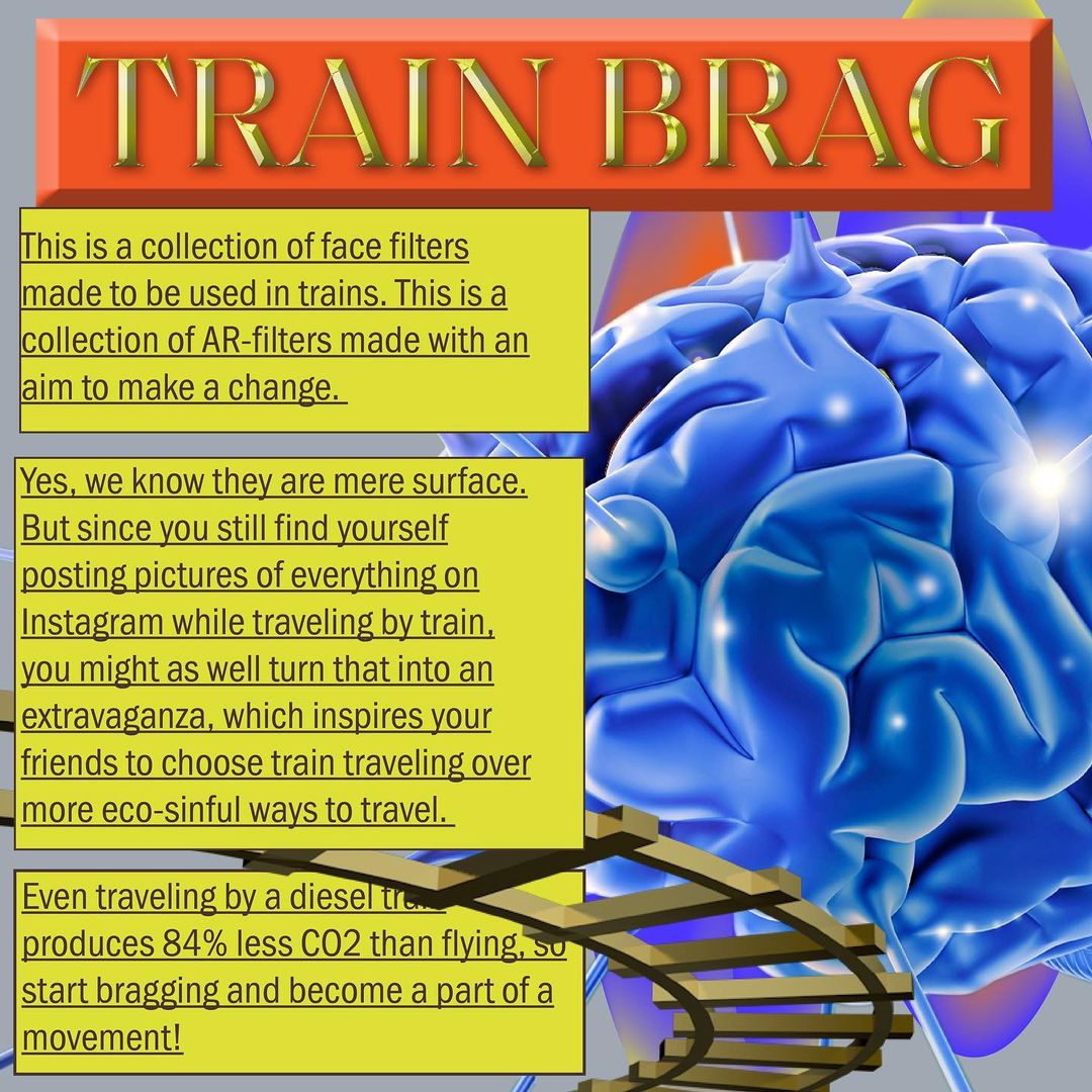
Ada Peiretti – Showcase Curation & Design
Ilkka Malin – Showcase Curation & Design
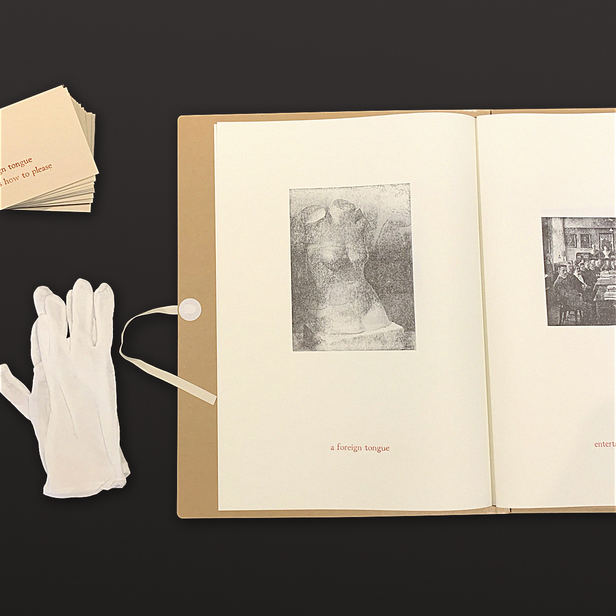
Helmi Dominguez Vanha-aho – Well-being & Showcase Curation
Stephan Garneau – Well-being & Editor (text)
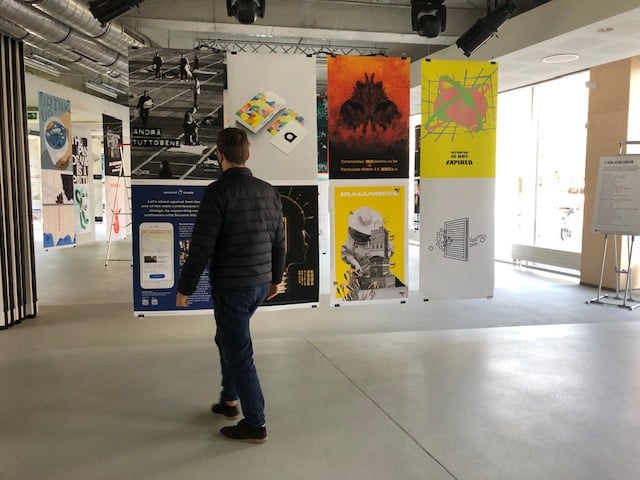
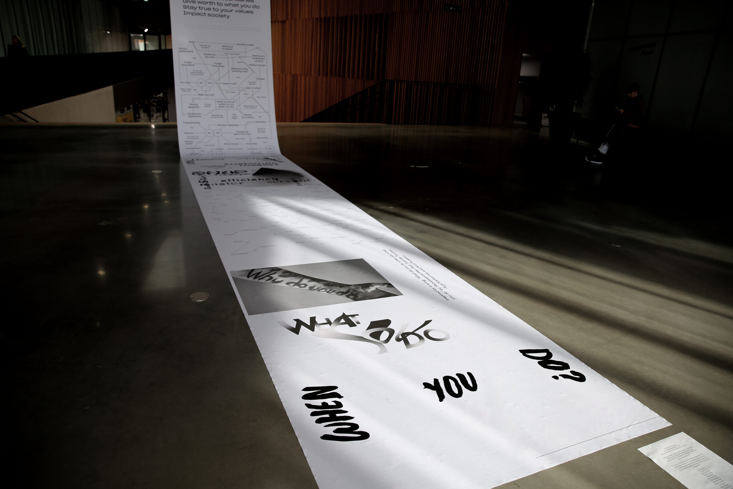
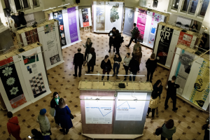
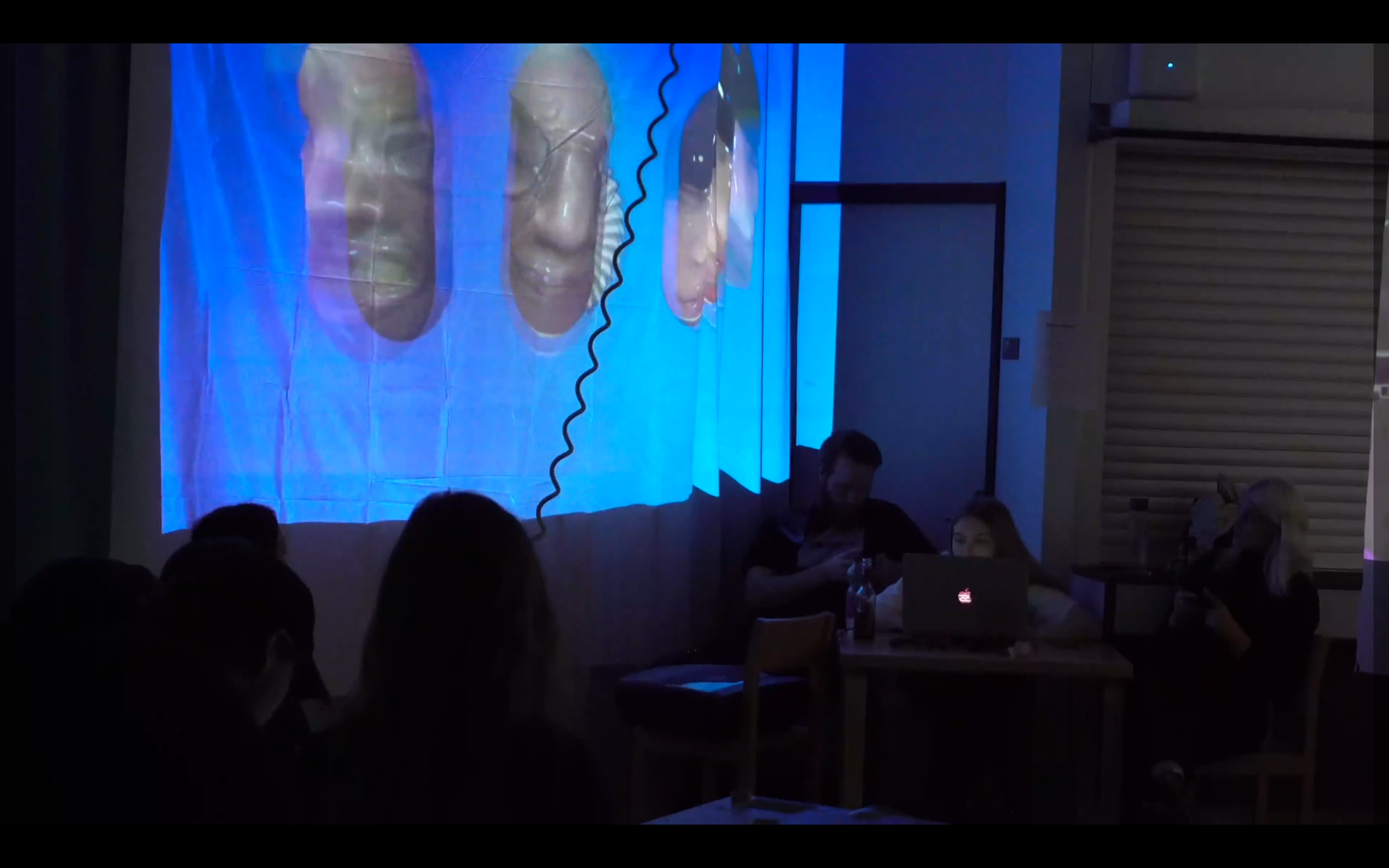
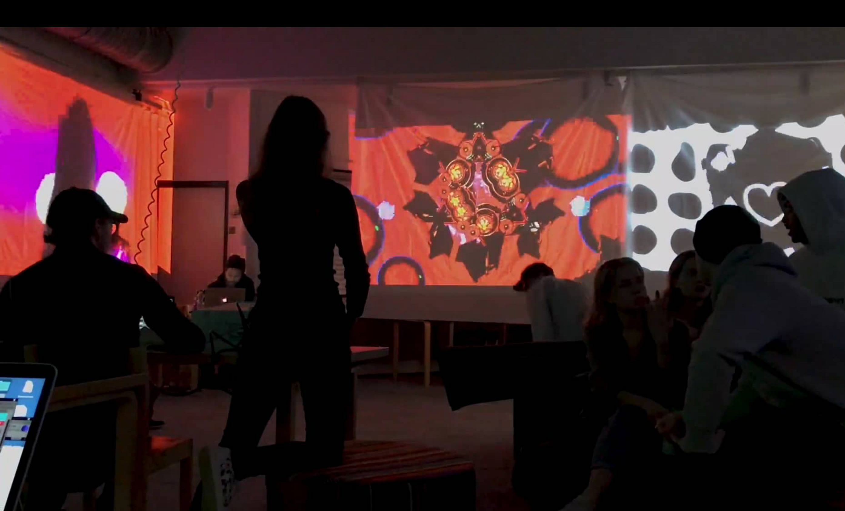
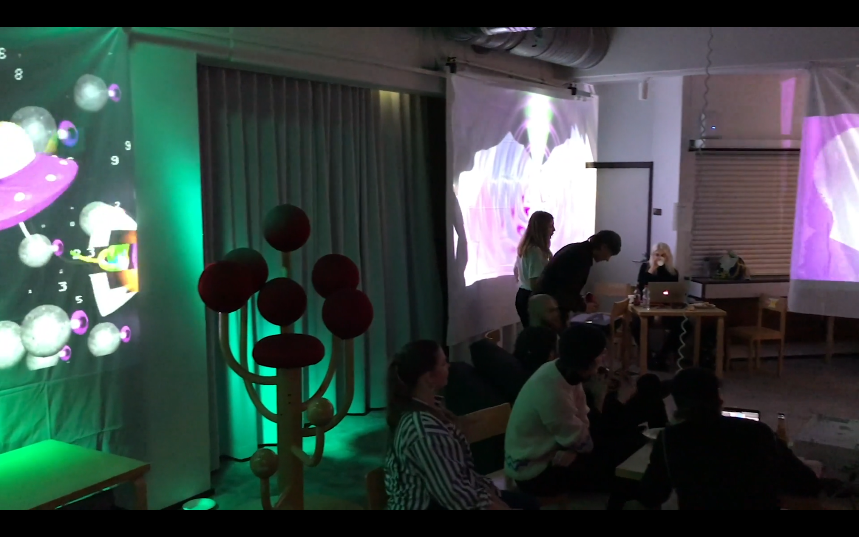
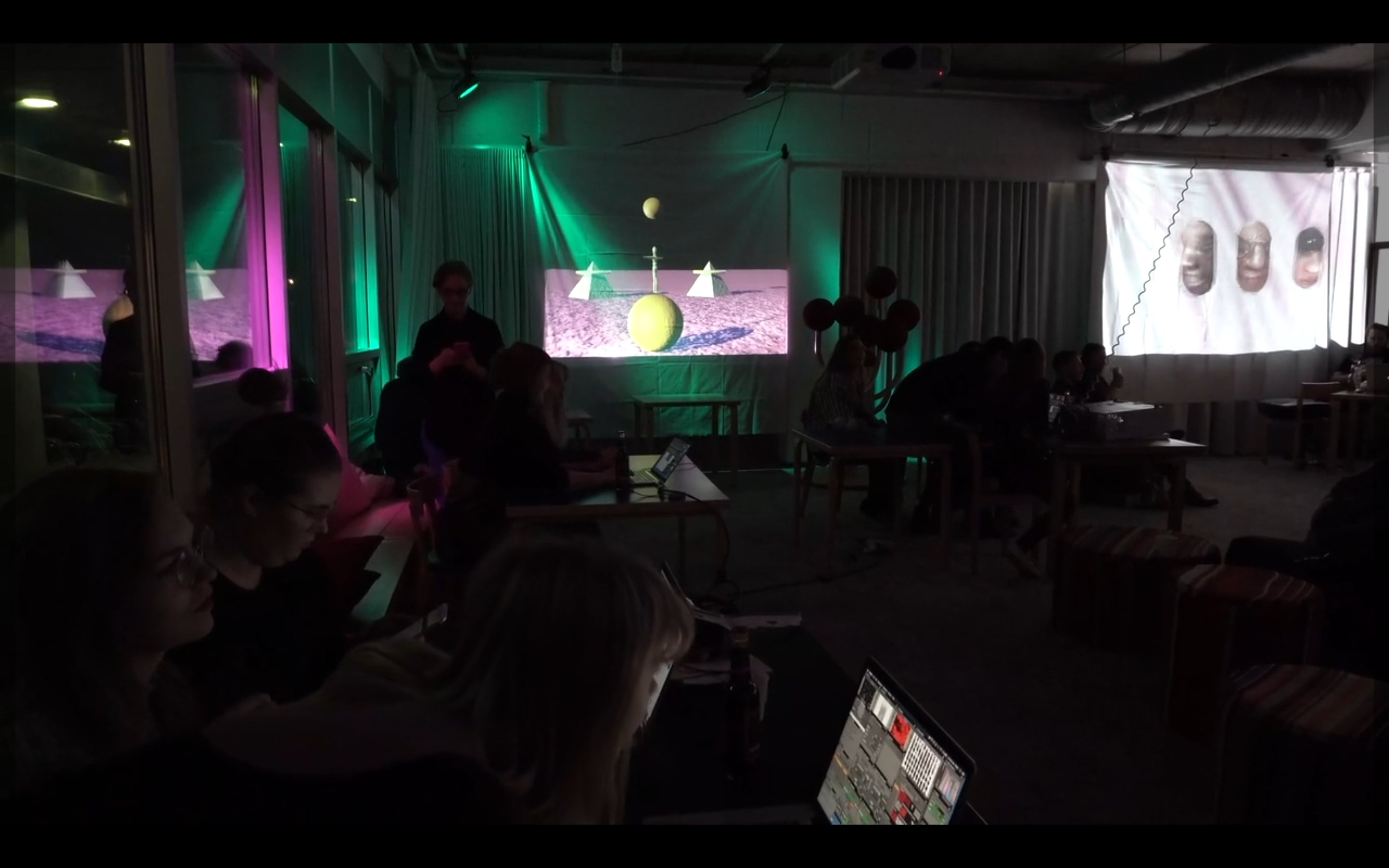
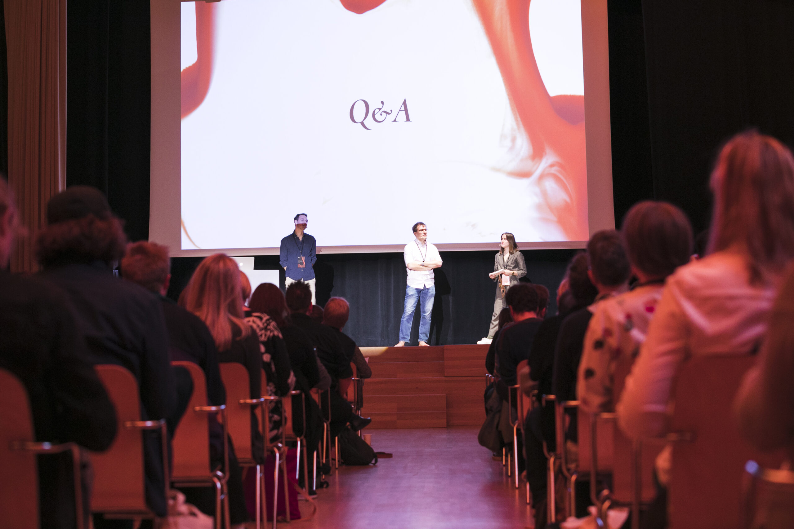
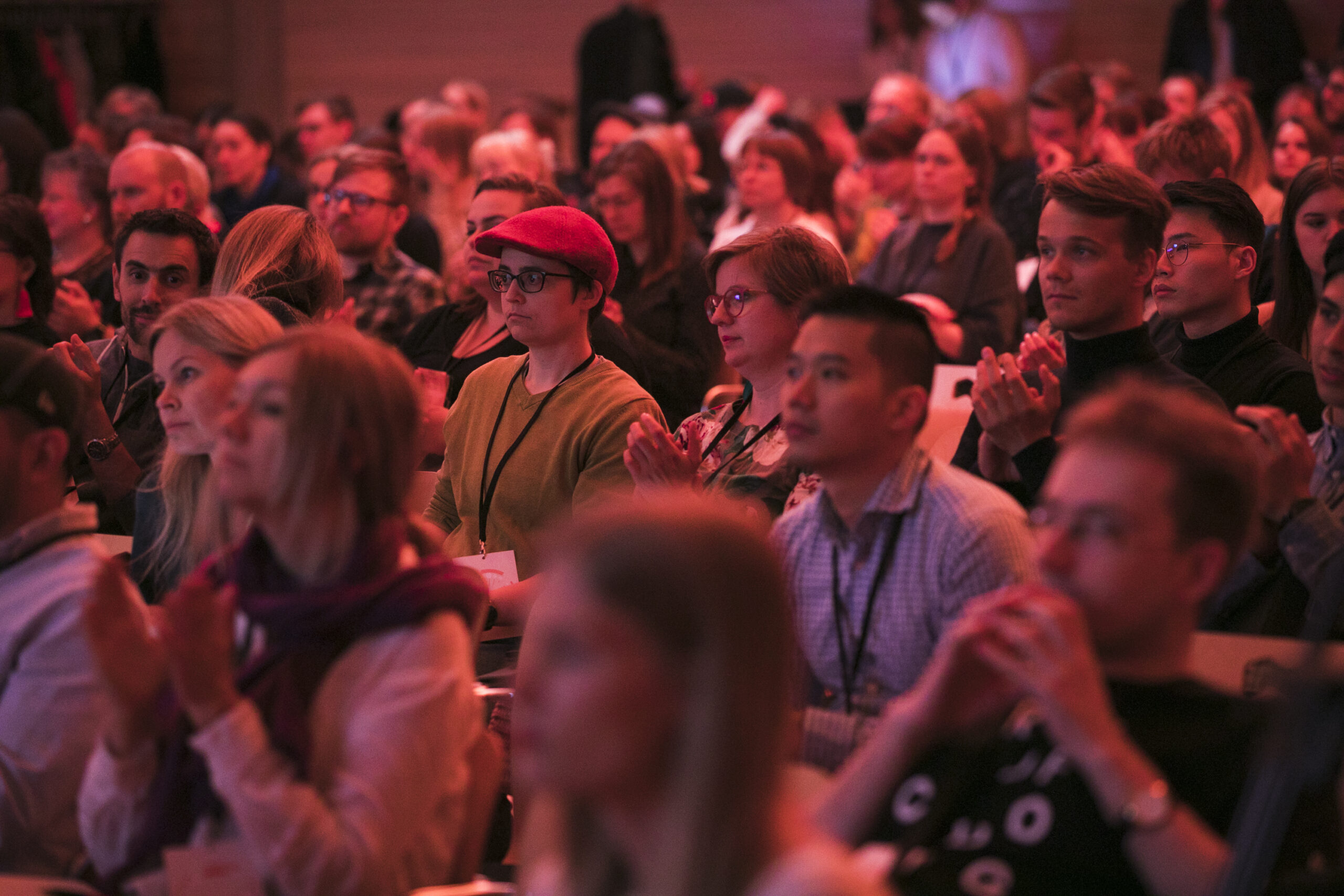
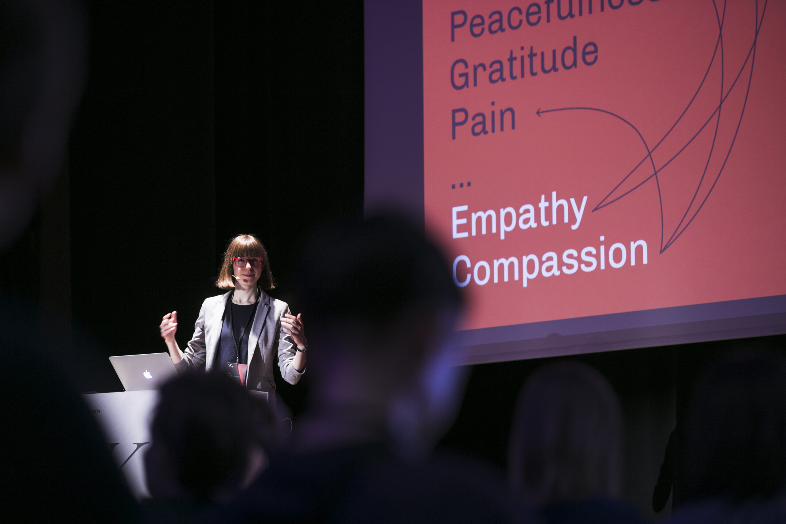
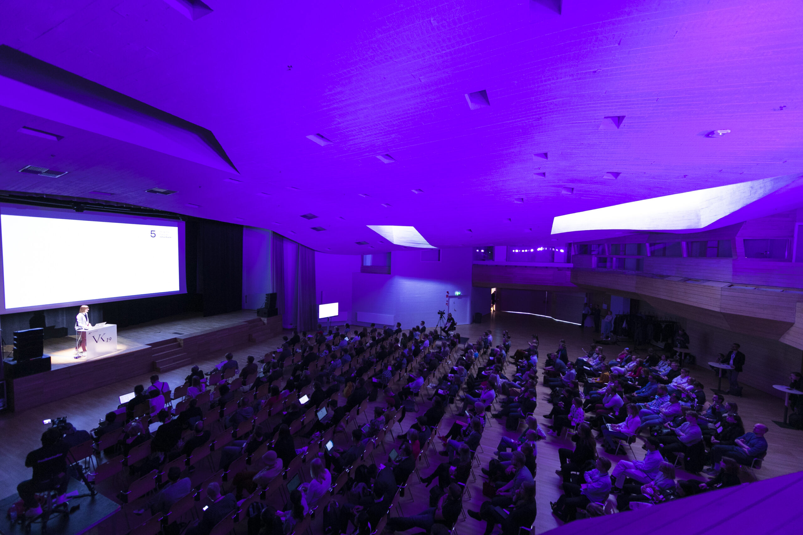
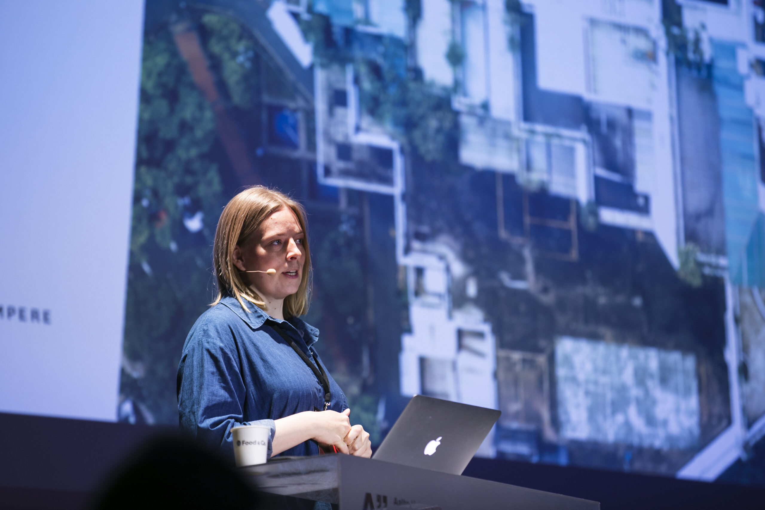
Conference photos: Iiro Immonen
[Conference background]
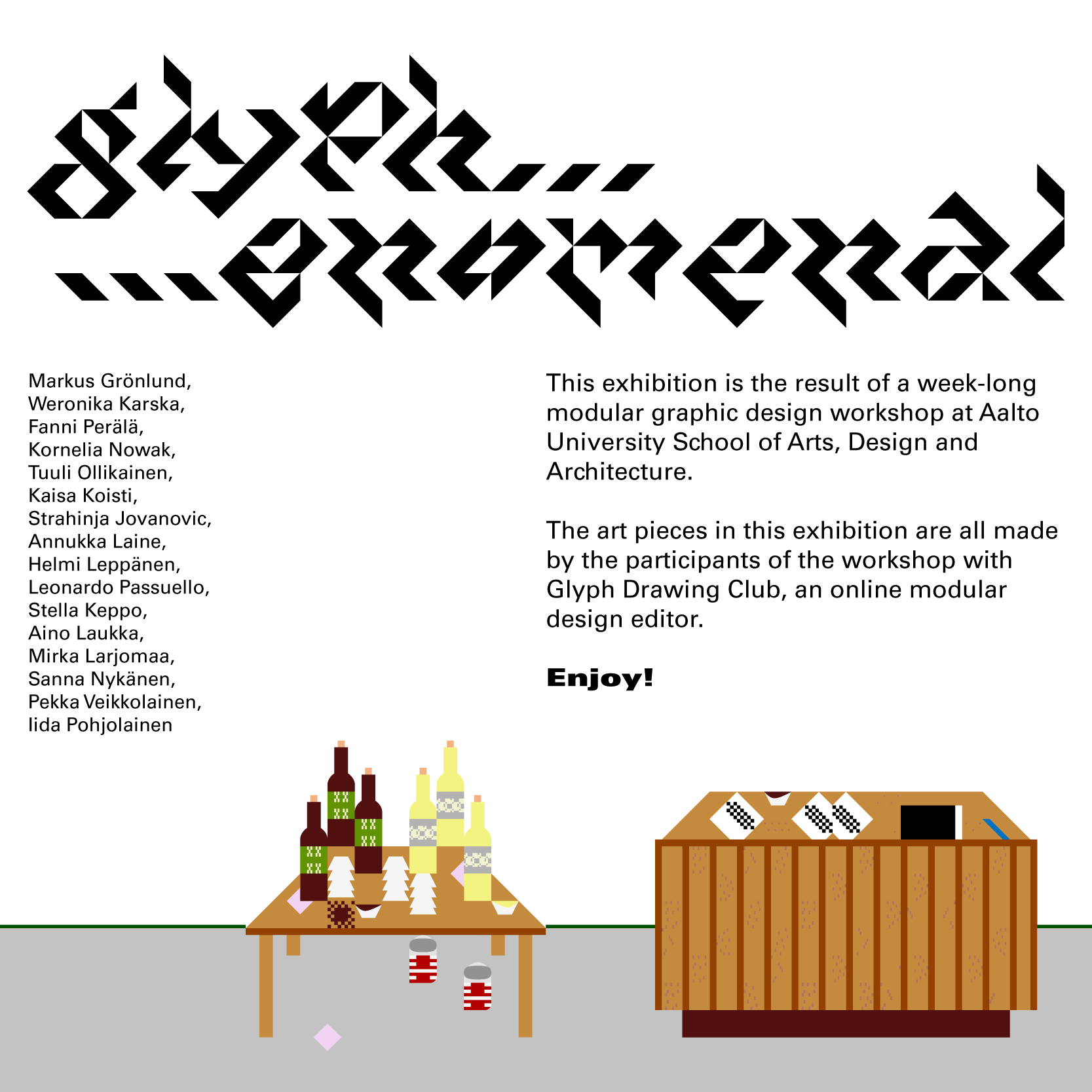
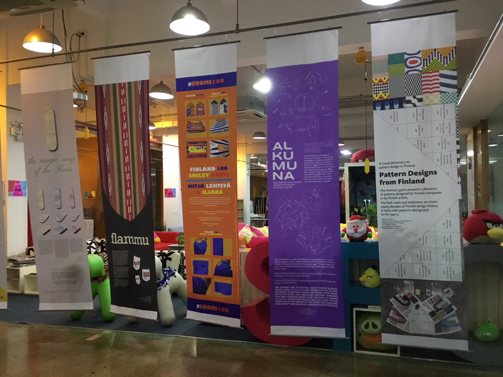
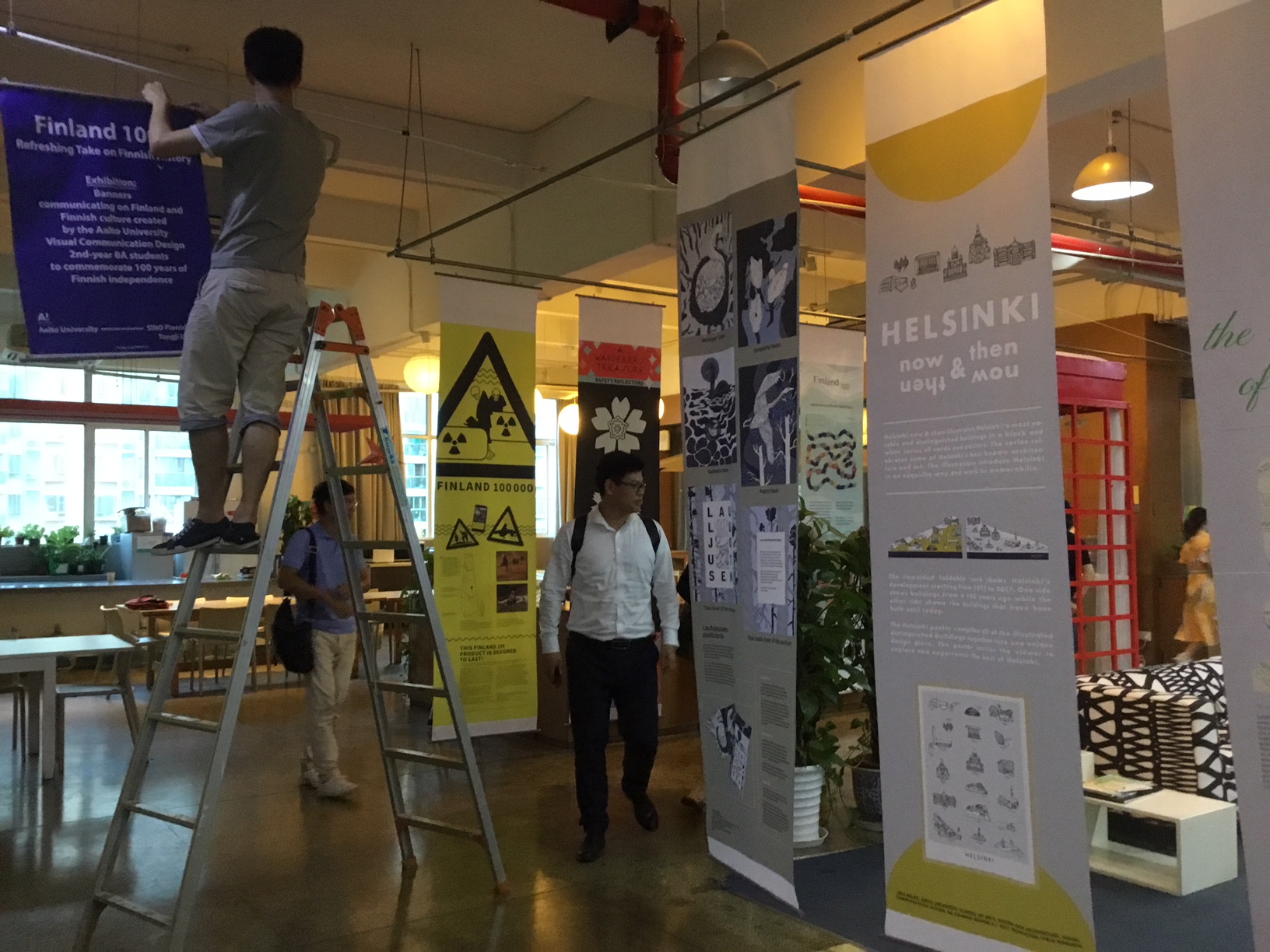
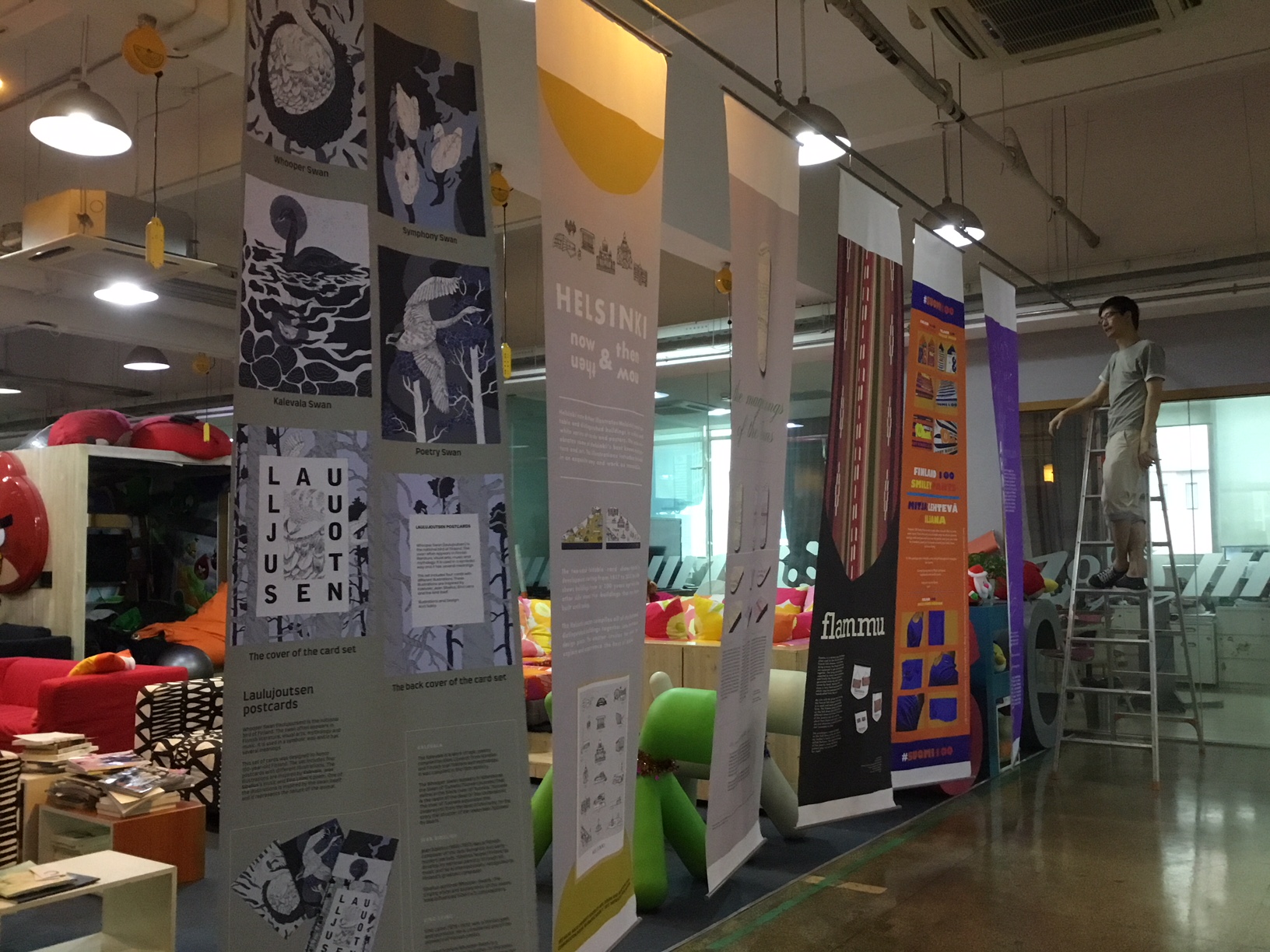
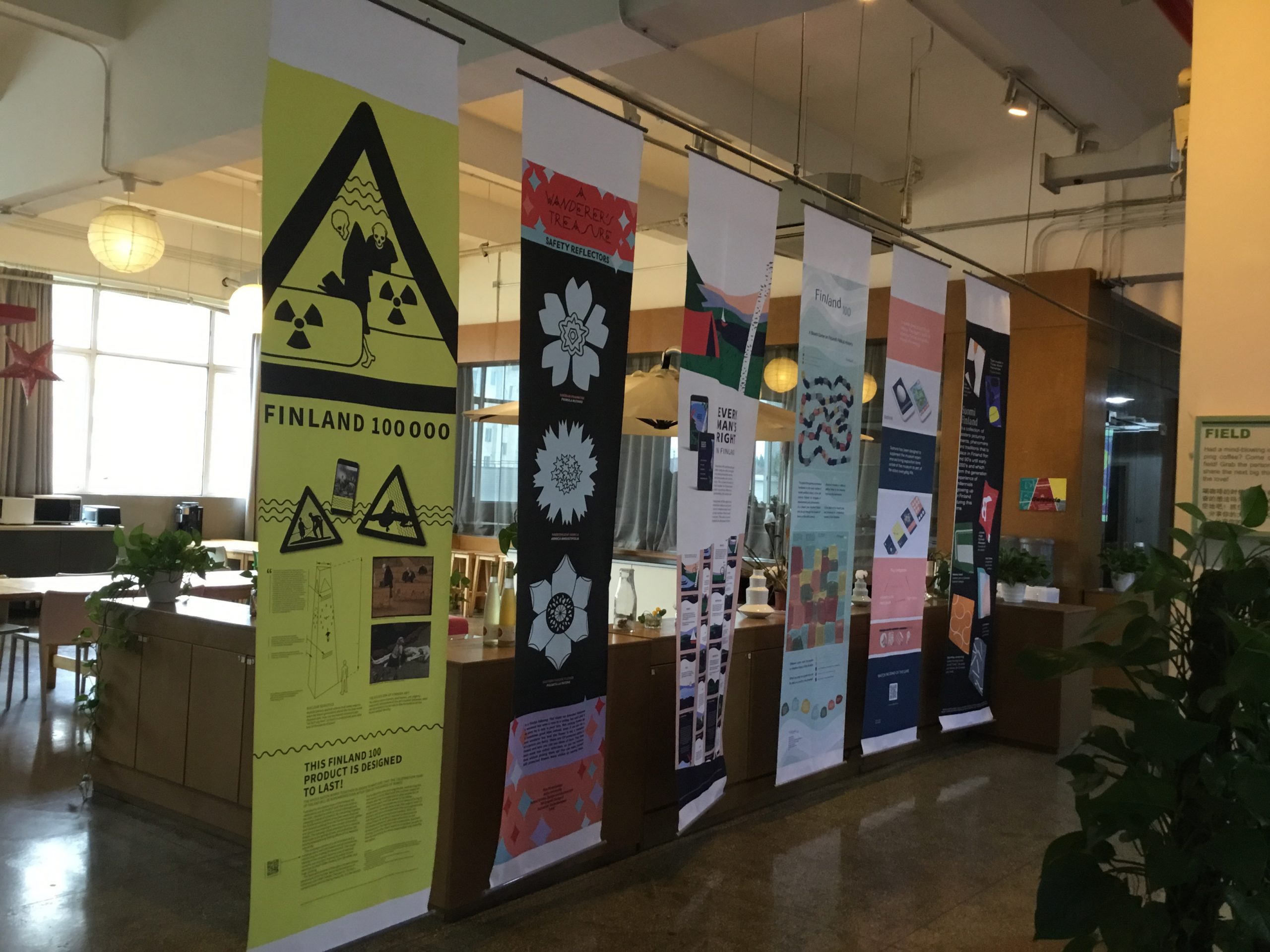
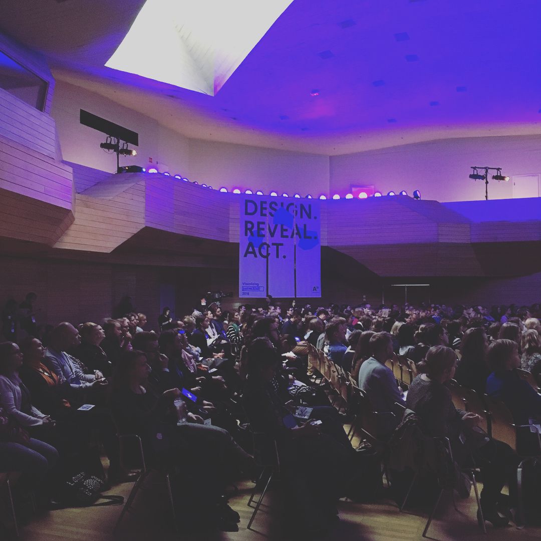
Visualizing Knowledge has been held every year since 2012 in Helsinki, Finland. It was formerly known as Tieto Näkyväksi and organized by Jonatan Hildén and Juuso Koponen from Koponen + Hildén. In 2017, the event became a part of Aalto University and is now organized by a highly motivated team of students, faculty and staff from the fields of Visual Communication and Information Design.
Facebook: https://www.facebook.com/vizknowledge/
Twitter: https://twitter.com/vizknowledge/
Instagram: https://www.instagram.com/vizknowledge/
Vimeo: https://vimeo.com/vizknowledge